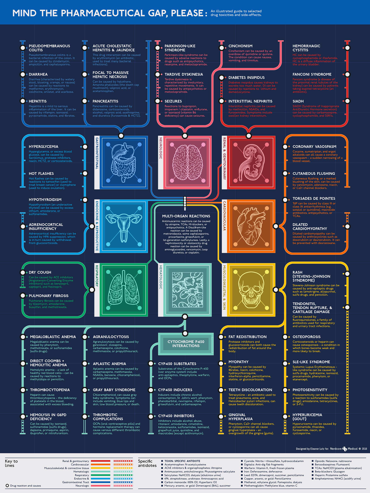
Mind the pharmaceutical gap, please
November 30 2016 · A collaboration with Nerdcore Medical
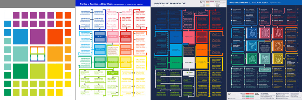
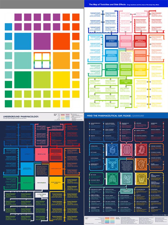
This week’s medical infographic poster explains the possible side effects of prescription drugs. Since most of the side effects were specific to an organ system, I decided to make a London tube map of the body with “stops” for each of the different diseases.
 This poster was a great excuse to buy the official London Underground font, which I’d wanted for a while. Unfortunately this ended up being more of a hassle than I anticipated. It was totally worth it to get the authentic font for the poster, but at the time the font had an undisclosed bug where you could only type the period character in the bold version. This was patched a few months later, but for this project I had to spend an hour going through the poster and changing every single period to a different font.
Other than the font issue this was a great project to work on, and I loved getting a chance to use the iconic color and typography of the London Underground. I switched from a white to navy background halfway through, and although this isn’t an exact replica of the original style I think the navy looks better as a poster.
-
Sources
- First Aid for the USMLE Books 1 & 2 (2015). Tao Le and Vikas Bhushan. © 2014 McGraw-Hill Education.
- NIH & FDA articles on: Pseudomembranous colitis , hepatitis, diarrhea, tardive dyskinesia, diabetes insipidus, interstitial nephritis, hemorrhagic cystitis, SIADH, ACE drugs, HIV/AIDS antiretroviral drugs, clomiphene, tamoxifen, hypothyroidism, coronary artery spasm, chloramphenicol, thrombocytopenia, tetracycline, and fluoroquinolones.
© This work is owned by Nerdcore Medical. Please email Eleanor Lutz for press & design questions, and Arun Mathews for business & resale inquiries.