Immunology pop art
October 5 2016 · A collaboration with Nerdcore Medical
This week’s collaboration with Nerdcore Medical was inspired by a mashup of Japanese pop art and the old-school gamer style of Designer’s Republic. Pop art is usually a little too bright for me, but I ended up really liking the style when mixed with science and a 80’s video game vibe. I also love the dull green-gray-white pop art inspired color I found for the background of the poster.
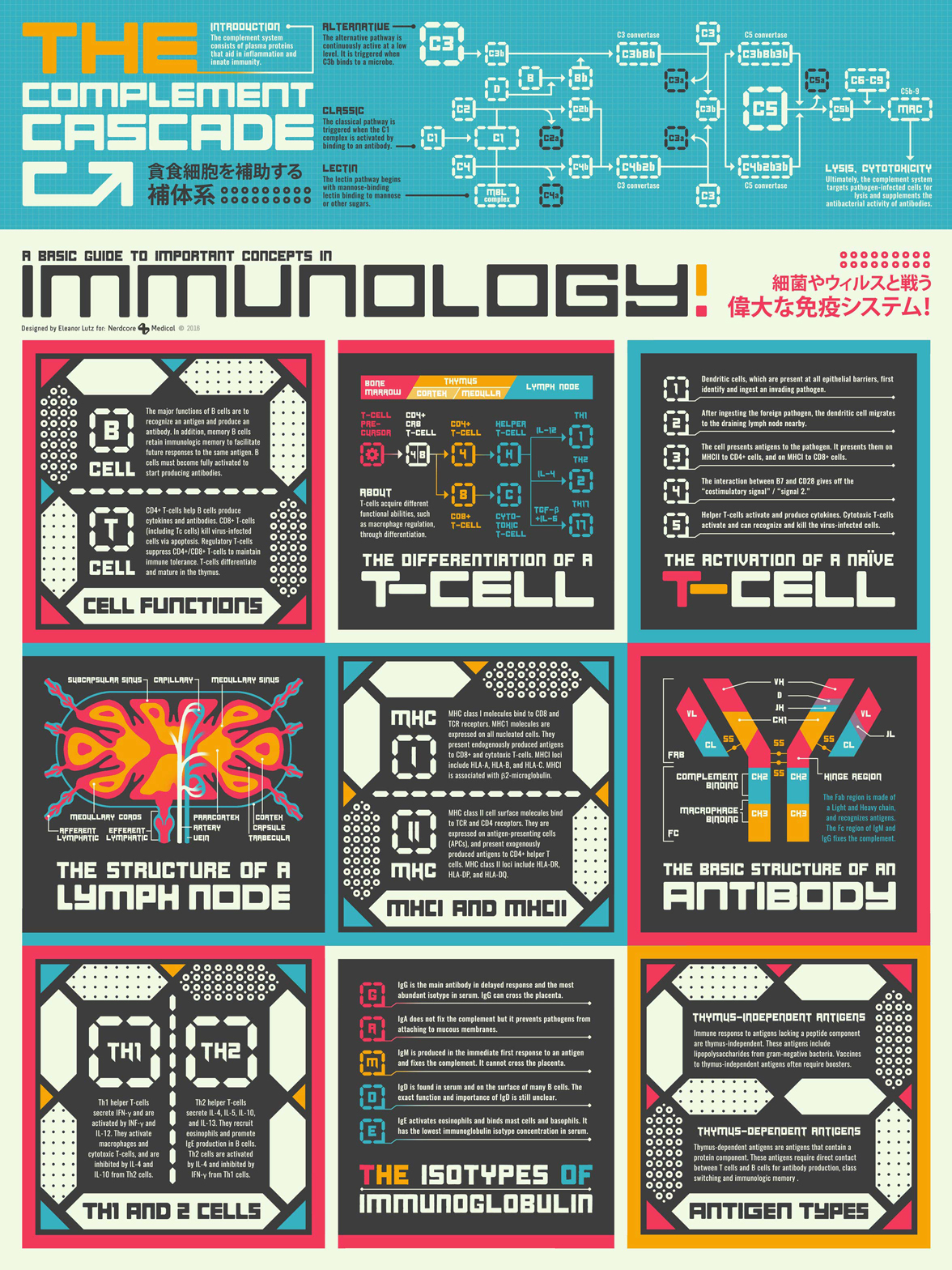
The infographic itself is an introduction to the human immune system. It’s fairly text heavy but there’s also some chemistry reaction diagrams and two anatomical illustrations. My favorite part of the poster was figuring out how to make a lymph node and an antibody look like something that would belong in a video game.
A lot of my collaborations with Nerdcore Medical are pastiche projects like this one, where I co-opted old graphic design styles for new infographics. It was a great opportunity to learn to design in different styles, and I think it also helped keep the project fresh after so many iterations of medical infographics.
-
Sources
- First Aid for the USMLE Books 1 & 2 (2015). Tao Le and Vikas Bhushan. © 2014 McGraw-Hill Education.
- Fonts: Origicide by Koczman Bálint and Oswald Medium by Vernon Adams
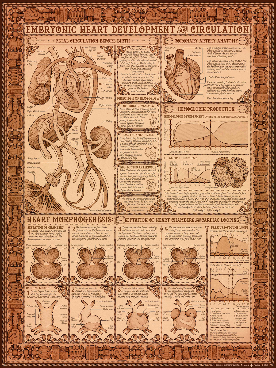
How to build a human heart
September 28 2016 · A collaboration with Nerdcore Medical
This week’s infographic is my 2nd collaboration with Nerdcore Medical. The poster explains how a baby’s heart develops while in the womb. It’s a bit of a hodgepodge of different elements - there are anatomical changes, molecular changes, and also some sections on basic anatomy. We were going for a Victorian steam-punk poster style, and it was really fun to fill up a medical diagram with embellishments and scrollwork.
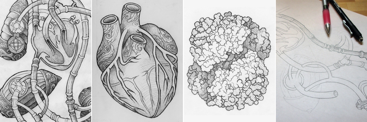
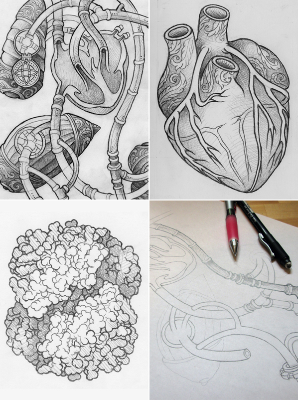
One of the major challenges was making the diagrams look Victorian, but still keeping the details accurate. So for most of the figures I stuck with very simple embellishments. For example, all of the veins and arteries in the biggest figure should be in the correct place - they’re just tweaked a little to look like pipes instead of organic tubes. Since the poster was primarily about heart development, I could add a little more decoration to the other organs in each diagram. We only included organs like the liver as a reference point to major blood vessels, so it didn’t matter too much if I added scrolls or gears to these organs.
I got to hand-draw all of the diagrams with a paper and pencil, which was a fun change of pace from my usual digital work. Every time I make a large hand-drawn design I’m reminded of all the pre-photography era scientists who made their science figures by hand. As much as I love design I’m really happy we don’t have to do that anymore for our research.
-
Sources
- First Aid for the USMLE Books 1 & 2 (2015). Tao Le and Vikas Bhushan. © 2014 McGraw-Hill Education.
- Fetal hemoglobin during infancy and in sickle cell adults. Edoh et al. Afr Health Sci. 2006 Mar; 6(1): 51-54
- Hemoglobin molecule structure. RCSB Protein Data Bank
- Development of the Heart: Formation of the Heart Loop Review of Medical Embryology Book © 1982 Ben Pansky. Embryome Sciences.
- Fonts: Hustlers Rough by Decade Type Foundry and Calligraffiti by Open Window.
A field guide to dangerous bacteria
September 21 2016 · A collaboration with Nerdcore Medical
This week I’m excited to announce a special project! During the past year and a half I’ve been working with the wonderful people at Nerdcore Medical on a set of 20 medical infographics.
Nerdcore Medical is the studio behind science communication projects like the Bacterionomicon and the Occam’s Razor card game. For this project I worked with Dr. Arun Mathews, a chief medical officer in Texas.
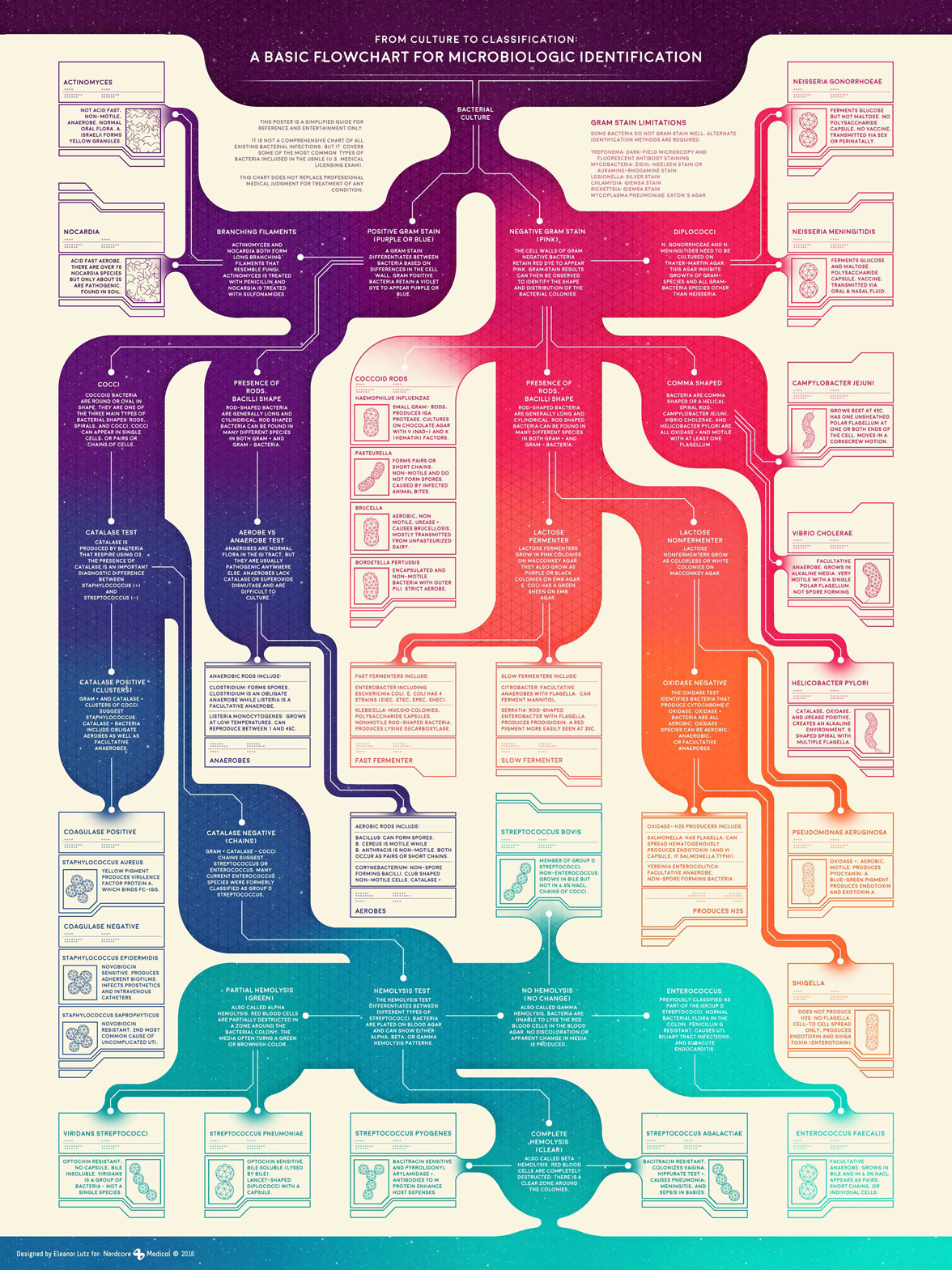
We wanted to make a set of beautiful posters that would combine art with study guides for medical school exams. This first one is an ID guide to common bacterial infections in human patients. The flowchart shows the steps you would take to identify a bacterial infection, and what each of the results might mean.
I’d never really thought much about lab tests before, so this was a really fun infographic to research and put together. Arun was an amazing collaborator - he fact-checked every single poster, picked the most important medical topics to cover, and even sent me reference books used by medical students.
Most of our posters are pretty specific to the medical field, but I’m going to be posting some of my favorites on this blog as they’re released. If you’re into medical infographics I would definitely recommend checking out the Nerdcore Medical Patreon to see the complete set of our work.
-
Sources
- First Aid for the USMLE Book 1 (2015). Tao Le and Vikas Bhushan. © 2014 McGraw-Hill Education.
- Virtual Interactive Bacteriology Laboratory. Michigan State university. © 2010 Michigan State University Board of Trustees. East Lansing, MI 48824
- CDC & Public Health Agency of Canada Pathogen Safety Data Sheets: Actinomyces, Nocardia, Staphylococcus aureus, Clostridium, Listeria monocytogenes, Streptococcus pneumoniae, Haemophilus influenzae, Pasteurella, Brucella, Bordetella pertussis, Enterobacter, Klebsiella, Bacillus, Corynebacterium, Streptococcus pyogenes, Citrobacter, Serratia, Salmonella, Yersinia enterocolitica, Streptococcus agalactiae, Neisseria gonorrhoeae, Neisseria meningitidis, Campylobacter jejuni, Vibrio cholerae, Helicobacter pylori, Shigella, Enterococcus faecalis, Pseudomonas aeruginosa.