Rough drafts and sketches: EKG Infographic
October 20 2016 · See the original infographic
Yesterday I published a sunrise-inspired infographic about human heartbeats. I thought I’d make a quick follow-up blog post taking you behind the scenes on the project.
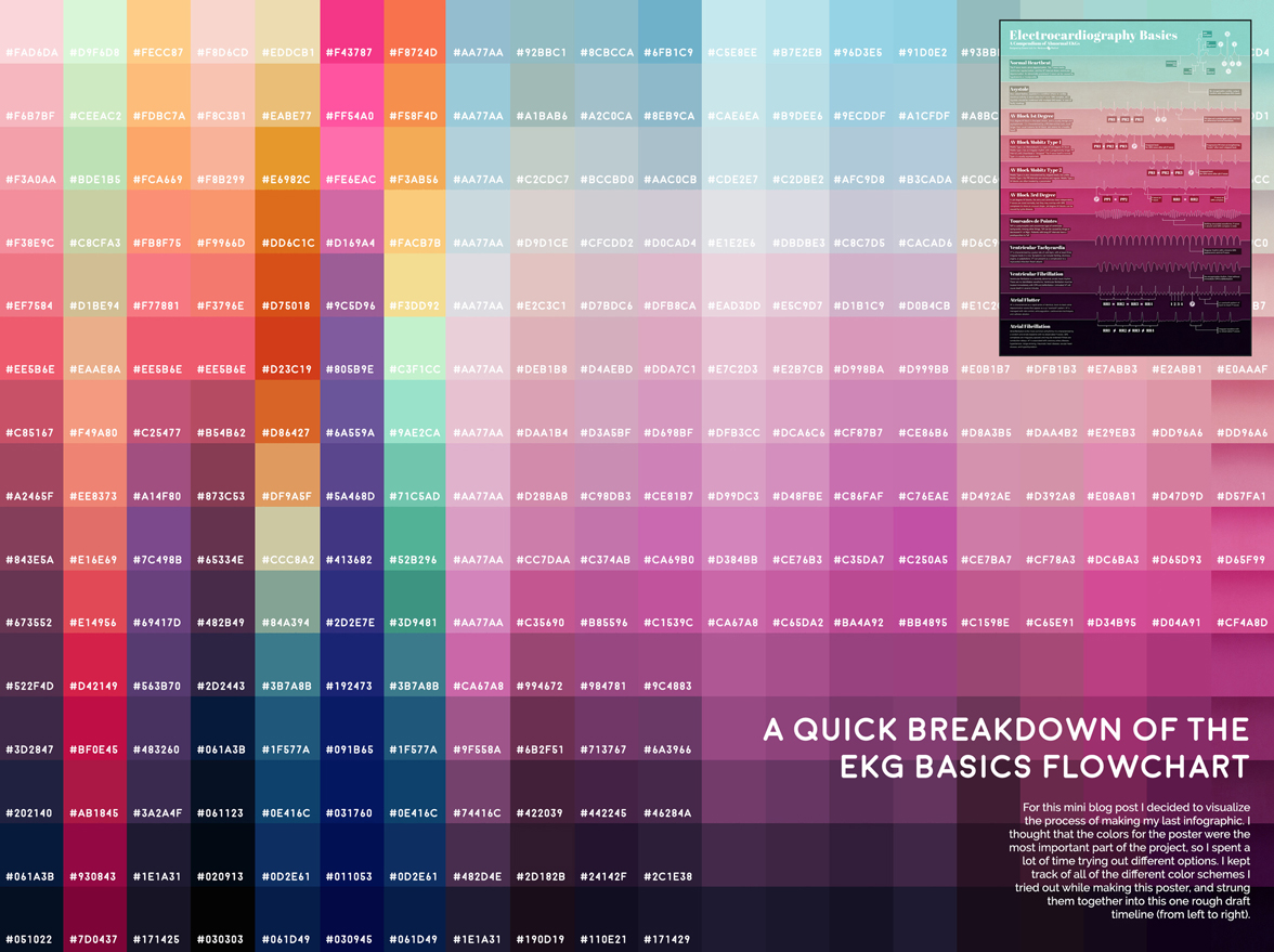
When I started the heartbeat poster I knew I wanted to make the color gradient the focal point. So I spent a lot of time trying out different color options for each blocked section. I kept track of all of the different color schemes and strung them together into one timeline to show you my entire decision process.
All of the text on the poster is white, so I was looking for a series of 15 colors that would look good together and also contrast well with white text. When I finally decided on the blue-to-pink gradient it still wasn’t dark enough, so I ended up adding a black overlay underneath the white font. I also added black shading below the border of every color. During the project we actually shifted some of the original information to a different poster, so the final design has 12 color blocks instead of the planned 15.
After collecting all of my progress pictures into this graphic I was surprised at the number of iterations I needed. Almost two thirds of the different versions were just slightly different attempts at the same general blue/pink theme. Although I’m happy with the end result I realized I should probably work on being a little more decisive when working on projects.

© This work is owned by Nerdcore Medical. Please email Eleanor Lutz for press & design questions, and Arun Mathews for business & resale inquiries.