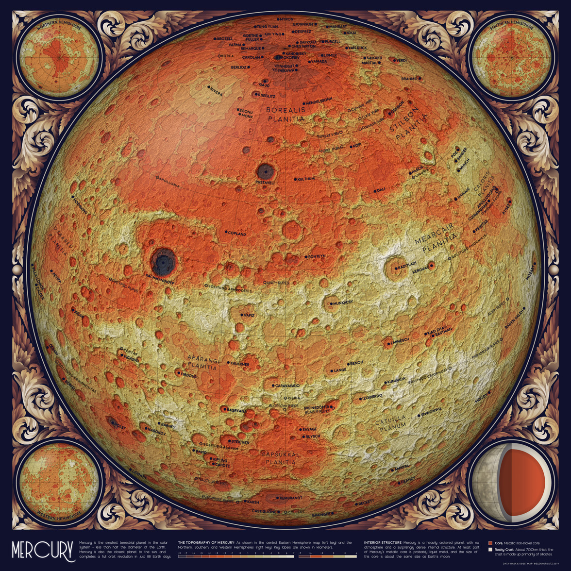
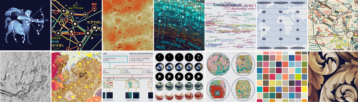
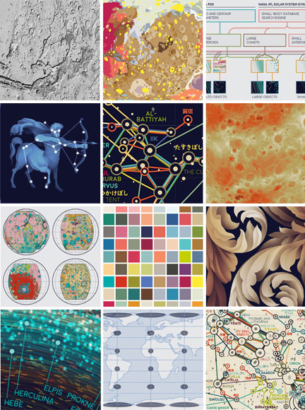
A Topographic Map of Mercury
June 17 2019 · Link to the Open-Source Code
This week’s blog post is a topographic map of the planet Mercury - the smallest planet and the one closest to the sun. I wanted to map each of the rocky planets in the same style, so this week’s code tutorial actually also includes code for mapping Mars, Venus, and the Moon.
Although Mercury has very few labeled features, I really liked the IAU naming theme for the planet. Craters on Mercury are named after famous artists - including some of my favorites, Lange (named for Dorothea Lange), Gaudí (Antoni Gaudí i Cornet), and Plath (Sylvia Plath).
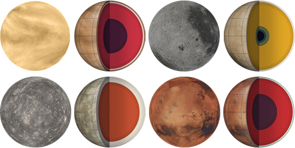
For this collection of topographic maps, I also designed a cutaway diagram showing the interior layers of each planet. These figures were a little tricky to plot, because the layers on some planets were so thin that they were virtually invisible. To show even the thinnest layers, I designed an adjusted diagram where every layer has a minimum visible thickness:
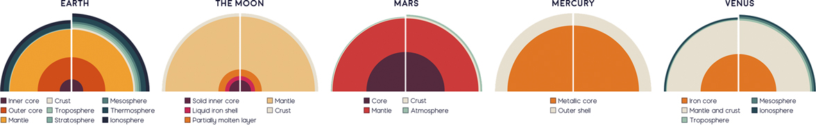
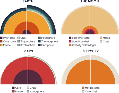 In the diagram above, the left half shows the actual thickness of each layer, and the right half shows an adjusted version where each layer has a minimum thickness. For Mercury and the Moon there’s actually no difference, but the effect is much stronger for the other planets with a very thin crust or atmosphere. In the end I decided to use the adjusted graph for Earth, Mars, and Venus (with a disclaimer in the key that the figures were not to scale).
Each of the planet core diagrams also has a blurred image of the surface on the outside of the sphere. To make these I used stock images from Stellarium, an open-source planetarium software. I intentionally blurred these images in Photoshop, because a more detailed surface illustration would take the focus away from the cutaway core diagram layers.
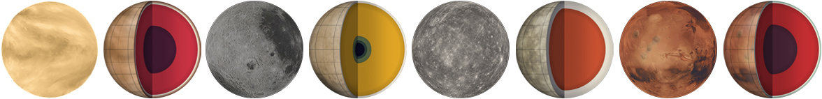
 The original Stellarium images shown alongside the finished cutaway diagrams for Venus, the Moon, Mercury, and Mars.
This project was a little heavier on the illustration side than my asteroid map last week. I had a lot of fun designing the scrollwork, and I also designed Photoshop overlays to add a 3D effect to the globes and the cutout core diagram. I’m working on a detailed illustration explanation to complement the code tutorial, so in a future blog post I’ll explain the design side of the project!
-
Sources
- Data: Gazetteer of Planetary Nomenclature, International Astronomical Union (IAU). © 2019 Working Group for Planetary System Nomenclature (WGPSN). Mercury In Depth. © 2019 NASA Science Solar System Exploration. Stellarium. © 2019 version 0.19.0. Mercury MESSENGER Global DEM 665m (64ppd) v2. © 2016 NASA PDS and Derived Products Annex. USGS Astrogeology Science Center. Reference texts: Astronomy, Andrew Fraknoi, David Morrison, Sidney C. Wolff et al. © 2016 OpenStax. Fonts: The labels on this map are typeset in Moon by Jack Harvatt. The title font is RedFlower by Type & Studio. Advice: Thank you to Oliver Fraser, Henrik Hargitai, Jennifer Hsiao, Chloe Pursey, and Leah Willey for their helpful advice in making this map.
An Orbit Map of the Solar System
June 10 2019 · Link to the Open-Source Code
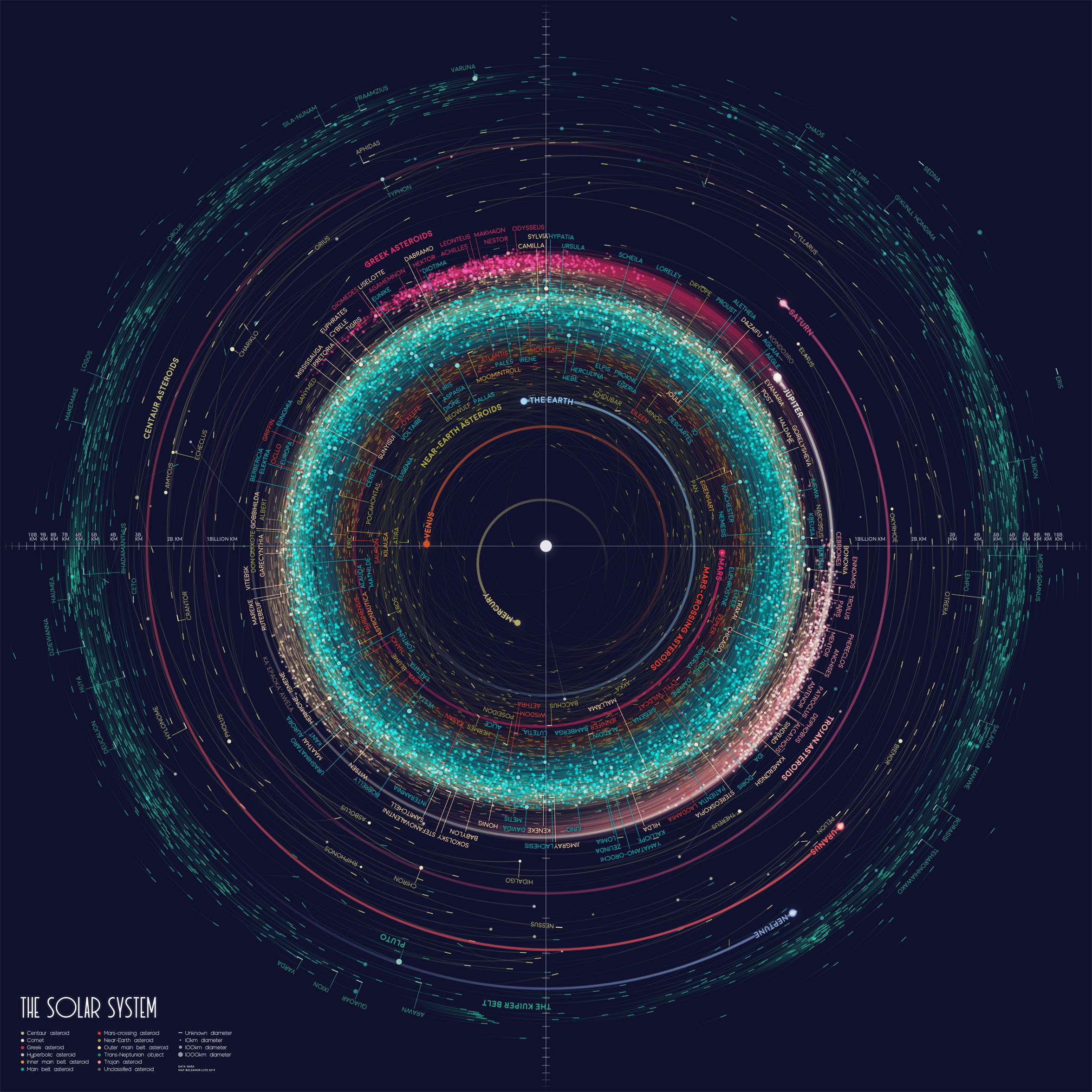
This week’s map shows the orbits of more than 18000 asteroids in the solar system. This includes everything we know of that’s over 10km in diameter - about 10000 asteroids - as well as 8000 randomized objects of unknown size. This map shows each asteroid at its exact position on New Years’ Eve 1999.
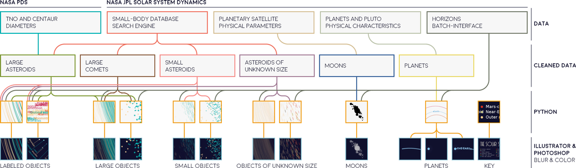
All of the data for this map is shared by NASA and open to the public. However, the data is stored in several different databases so I had to do a decent amount of data cleaning. I’ve explained all of the steps in detail in my open-source code and tutorial, so I’ll just include a sketch of the process here in this blog post:
One of the most challenging parts of this map was figuring out how to make everything legible. It turns out that things in the solar system are distributed somewhat logarithmically. There are exponentially more things closer to the sun, and exponentially more smaller things than big things. So I used a radial logarithmic scale to include large things, far-away things, and tiny, nearby things on the same map. Logarithmic maps aren’t particularly common, but in this case I figured it was ok since no one would use this map for navigation.
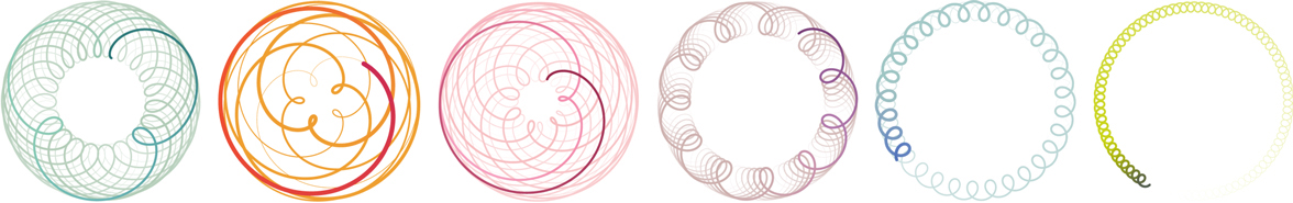
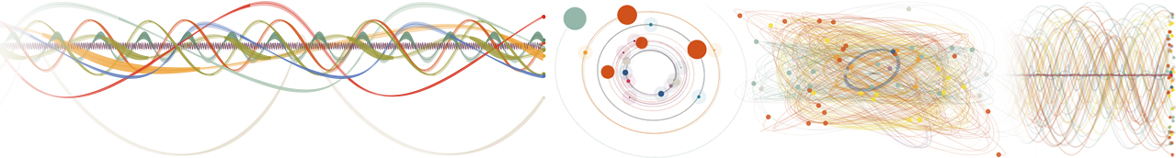
 For this map I used the NASA HORIZONS server to generate orbit paths centered around the sun. But HORIZONS can also generate orbits centered around anywhere else. From left to right, these rosettes show the surprisingly beautiful paths of Mercury, Venus, Mars, Jupiter, Saturn, and Uranus as seen from Earth. Venus in particular has been described through history as the Pentagram of Venus or the Rose of Venus.
In a dataset of this size, there were so many exceptions that I designed this map using design “guidelines” rather than rules. For example, at first I wanted to map each asteroid with an orbit tail reaching back 10 years. But many asteroids didn’t have enough data, and the inner asteroids moved so fast that the map was illegible from overlapping lines. So in the end the asteroid tails reach back to the last possible data point, or 10 years, or a quarter of the object’s orbit - whichever is smallest.
The name labels are also fairly arbitrary. I tried to label all the largest and most important asteroids, like the ones we’ve investigated with spacecraft. I also included every named object in the outer solar system because this data is pretty sparse. Since I didn’t have room for all the rest, I picked out my personal favorites, like Moomintroll, O’Keefe, and Sauron. Sadly there was no asteroid named Eleanor, but you can find out if your own name is an asteroid by searching the JPL Small-Body Database Browser.
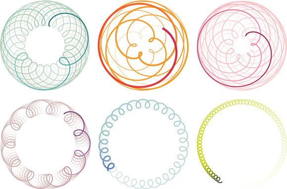
 Some early Python experiments on visualizing orbital paths. In these drafts I used data from the moons of Neptune, Jupiter, and Saturn, because a few dozen moons are much easier to manage than several thousand asteroids. Although I didn’t end up using the code, I still really like the orbit ribbon diagram (the ribbon thickness shows the orbit movement in the z axis).
One last fun fact about this map - you might notice that Pluto is shown inside Neptune’s orbit. It turns out that about 10% of the time, Pluto is actually closer to the sun than Neptune. On 12/31/99 Pluto is further away, but it appears closer here because Neptune’s orbit tail reaches back in time to a point when it was closer to the sun. (I actually didn’t know about this before the project, so I spent a long time trying to find the bug in the code before finally realizing that the map was working as it should).
-
Sources
- Data: NASA HORIZONS, NASA Jet Propulsion Laboratory. © 2019 California Institute of Technology. Object Classification, NASA PDS: Small Bodies Node. © JPL Solar Dynamics Group. Planets and Pluto: Physical Characteristics, NASA Jet Propulsion Laboratory. © 2001 California Institute of Technology. Planetary Satellite Physical Parameters, NASA Jet Propulsion Laboratory. © California Institute of Technology. NEO Earth Close Approaches, NASA Jet Propulsion Laboratory. © 2019 California Institute of Technology, CNEOS Center for Near Earth Object Studies. TNO and Centaur Diameters, Albedos, and Densities V1.0, W.R. Johnston. © 2018 NASA Planetary Data System. Reference texts: Astronomy, Andrew Fraknoi, David Morrison, Sidney C. Wolff et al. © 2016 OpenStax. Fonts: The labels on this map are typeset in Moon by Jack Harvatt. The title font is RedFlower by Type & Studio. Advice: Thank you to Jeff Heer, Chloe Pursey, and Leah Willey for their helpful advice in making this map.
An Atlas of Space
June 3 2019
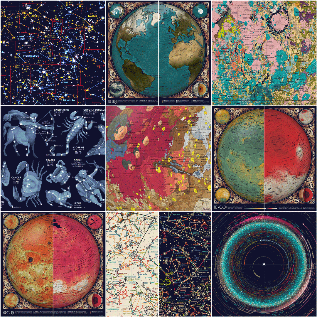
I’m excited to finally share a new design project this week! Over the past year and a half I’ve been working on a collection of ten maps on planets, moons, and outer space. To name a few, I’ve made an animated map of the seasons on Earth, a map of Mars geology, and a map of everything in the solar system bigger than 10km.
Over the next few weeks I want to share each map alongside the open-source Python code and detailed tutorials for recreating the design. All of the astronomy data comes from publicly available sources like NASA and the USGS, so I thought this would be the perfect project for writing design tutorials (which I’ve been meaning to do for a while).
 I’m still working on finishing all of the tutorials (there’s a lot of information I want to cover!). But here’s a list of everything I’m planning to talk about for sure: Working with Digital Elevation Models (DEMs) in Bash and Python. Working with ESRI shapefiles in Python. Using the NASA HORIZONS orbital mechanics server and scraping internet data. Working with NASA image data. Combining many datasets into one map. Color palettes and style design. Updating vintage illustrations and painting in Photoshop. Plotting with symbols and different languages in Matplotlib. Editing Python outputs in Illustrator. Using the IAU Gazetteer of Planetary Nomenclature. Map projections in Python Cartopy. Mapping constellations using star catalog data.
I originally learned Python for my grad school research, which involved processing video recordings of mosquito behavior. I really liked the language, and in the past few years I’ve been using Python extensively for data management and design. I also love teaching Python (I volunteer for Software Carpentry, and I taught Data Science for Biologists at UW last year with Bing Brunton and Kam Harris). So if you’re interested in beginner-friendly explanations of Python cartography, web scraping, or using the NASA orbital mechanics server, check back here next week for the first map tutorial! Up next week - A map of everything in the solar system bigger than 10km.