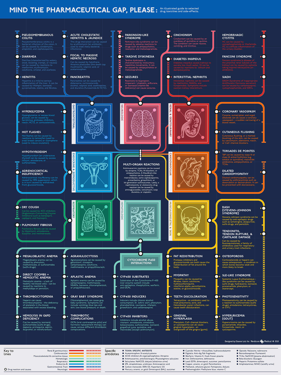
Mind the pharmaceutical gap, please
November 30 2016 · A collaboration with Nerdcore Medical
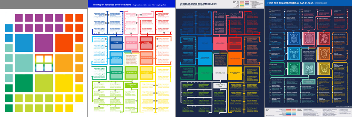
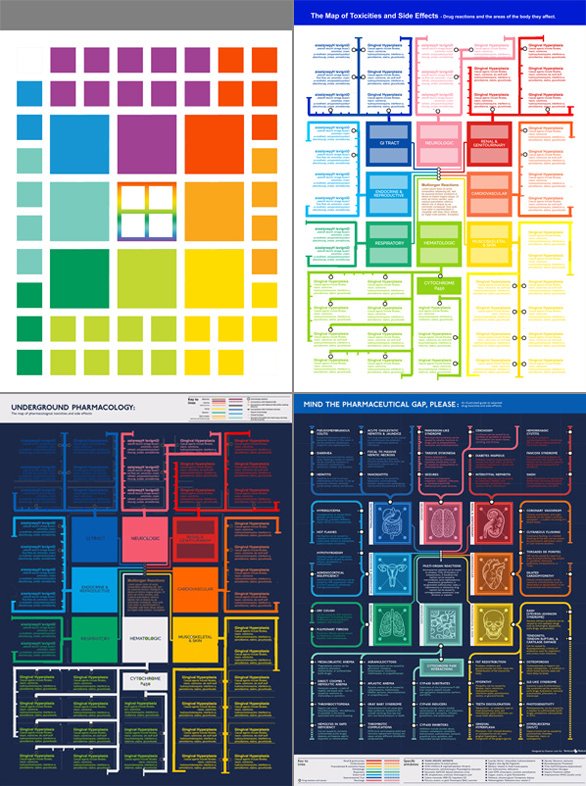
This week’s medical infographic poster explains the possible side effects of prescription drugs. Since most of the side effects were specific to an organ system, I decided to make a London tube map of the body with “stops” for each of the different diseases.
 This poster was a great excuse to buy the official London Underground font, which I’d wanted for a while. Unfortunately this ended up being more of a hassle than I anticipated. It was totally worth it to get the authentic font for the poster, but at the time the font had an undisclosed bug where you could only type the period character in the bold version. This was patched a few months later, but for this project I had to spend an hour going through the poster and changing every single period to a different font.
Other than the font issue this was a great project to work on, and I loved getting a chance to use the iconic color and typography of the London Underground. I switched from a white to navy background halfway through, and although this isn’t an exact replica of the original style I think the navy looks better as a poster.
-
Sources
- First Aid for the USMLE Books 1 & 2 (2015). Tao Le and Vikas Bhushan. © 2014 McGraw-Hill Education.
- NIH & FDA articles on: Pseudomembranous colitis , hepatitis, diarrhea, tardive dyskinesia, diabetes insipidus, interstitial nephritis, hemorrhagic cystitis, SIADH, ACE drugs, HIV/AIDS antiretroviral drugs, clomiphene, tamoxifen, hypothyroidism, coronary artery spasm, chloramphenicol, thrombocytopenia, tetracycline, and fluoroquinolones.
Rough drafts and sketches: Virus Infographic
November 23 2016 · See the original infographic
For my last blog post I published a poster about a few of the many different kinds of human viruses. I thought today I’d post an extra blog post on how I designed the poster.
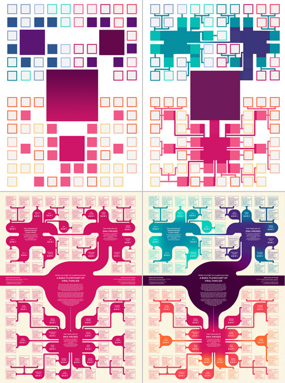
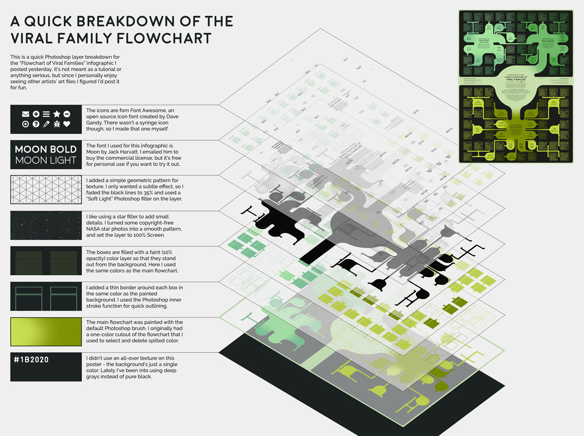
The “blob-tree” itself was fairly simple - I started off by making a grid with enough squares for each of the viral species. Then I arranged species groups and fiddled with the layout until I had something vaguely symmetrical.
After filling in all of the blob-tree branches, I rounded out the corners and added some subtle color changes to differentiate between major virus types. This infographic originally started out pink and purple on a cream background, but then I decided that a green-black color scheme would be a better fit for the virus theme.
Finally I added the text (Moon font by Jack Harvatt) and the symbol icons (from Font Awesome by David Gandy). Font Awesome is a library with more than 600 open-source icons, and I use it in pretty much all of my web projects.
For this poster I also used a noise texture that I made from copyright-free NASA star photos.
A flowchart of dangerous viruses
November 22 2016 · A collaboration with Nerdcore Medical
For this week’s infographic I made a poster about some of the most common kinds of human viruses. Viruses cause anything from the common cold to more serious diseases such as HIV, rabies, and Ebola. Because we can’t use antibiotics to treat viruses, vaccines are vital to protect people and animals from deadly diseases.
My goal for this infographic was to visualize the huge variety of viral species. I used small symbols to categorize several interesting aspects of each virus - whether or not it was transmitted by insects, used DNA vs RNA, or if a vaccine existed for the disease. We still don’t have a vaccine for many of diseases on this infographic, but I think it’s encouraging to see how far we’ve come (particularly for devastating diseases like polio, smallpox, and rabies).
When I started the project I had a list of about 60 viruses I needed to organize into neat groups. Since viruses aren’t technically alive, I wanted to illustrate my list in a way that reflected the unconventional taxonomic relationships between virus species. In the end I decided to make a “blob-tree” that grouped viruses into general categories, but didn’t make definitive statements about ancestral virus hierarchy.
I used 33 different source articles for this project, from organizations such as the CDC and WHO. I also had help from Dr. Arun Mathews, a Chief Medical Officer in Texas who fact-checked my work and suggested useful articles.
-
Sources
- First Aid for the USMLE Books 1 & 2 (2015). Tao Le and Vikas Bhushan. © 2014 McGraw-Hill Education.
- CDC, WHO, PubMed and & NIH: List of vaccines used in the United States, Hepatitis C, Cowpox, Molluscum contagiosum, Epstein-Barr virus, CMV, adenovirus, polyomavirus, SARS, coronavirus, echovirus, Eastern equine encephalitis virus, Western equine encephalitis, Crimean-Congo haemorrhagic fever, Dengue, SLEV, West Nile virus, cervical dysplasia, herpes, HSV keratitis, Varicella zoster, shingles, lassa fever, LCM, hantavirus, California encephalitis, ECHO virus, parainfluenza, Colorado tick fever, HTLV, Rift valley fever, herpesviruses.