Rough drafts and sketches: Virus Infographic
November 23 2016 · See the original infographic
For my last blog post I published a poster about a few of the many different kinds of human viruses. I thought today I’d post an extra blog post on how I designed the poster.
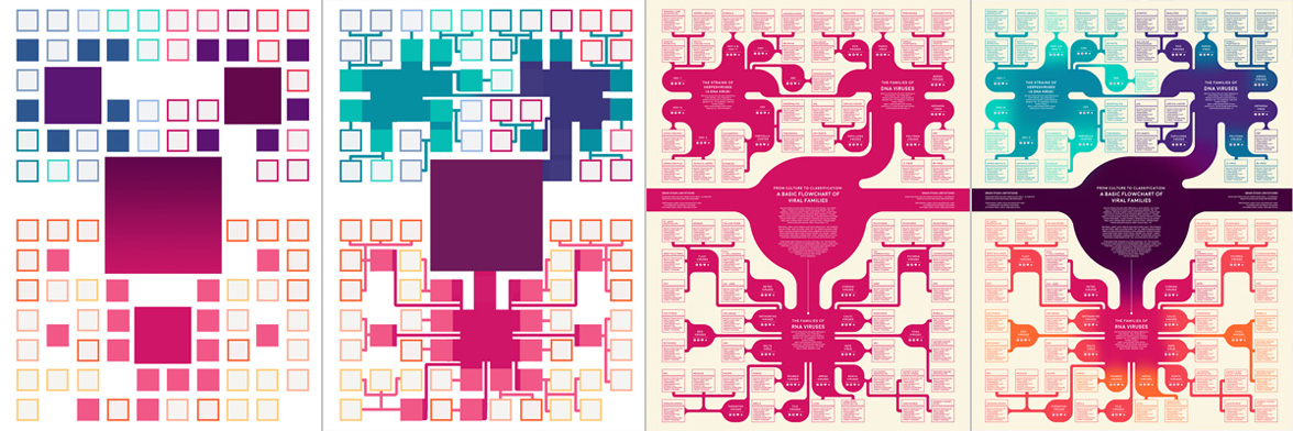
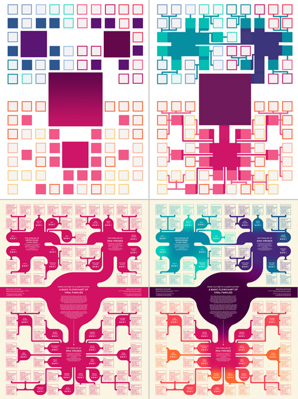
The “blob-tree” itself was fairly simple - I started off by making a grid with enough squares for each of the viral species. Then I arranged species groups and fiddled with the layout until I had something vaguely symmetrical.
After filling in all of the blob-tree branches, I rounded out the corners and added some subtle color changes to differentiate between major virus types. This infographic originally started out pink and purple on a cream background, but then I decided that a green-black color scheme would be a better fit for the virus theme.
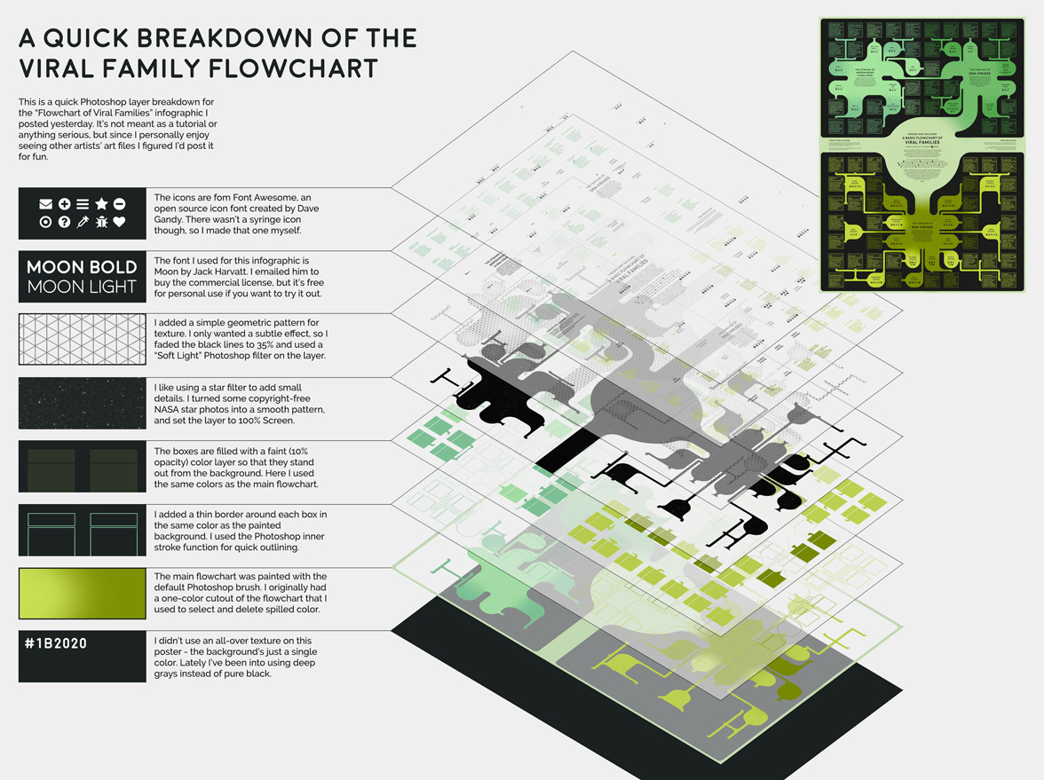
Finally I added the text (Moon font by Jack Harvatt) and the symbol icons (from Font Awesome by David Gandy). Font Awesome is a library with more than 600 open-source icons, and I use it in pretty much all of my web projects.
For this poster I also used a noise texture that I made from copyright-free NASA star photos.
© This work is shared under a Creative Commons Attribution-NonCommercial-NoDerivatives 4.0 International License.