A galaxy of molecules
May 16 2017 · A collaboration with Nerdcore Medical
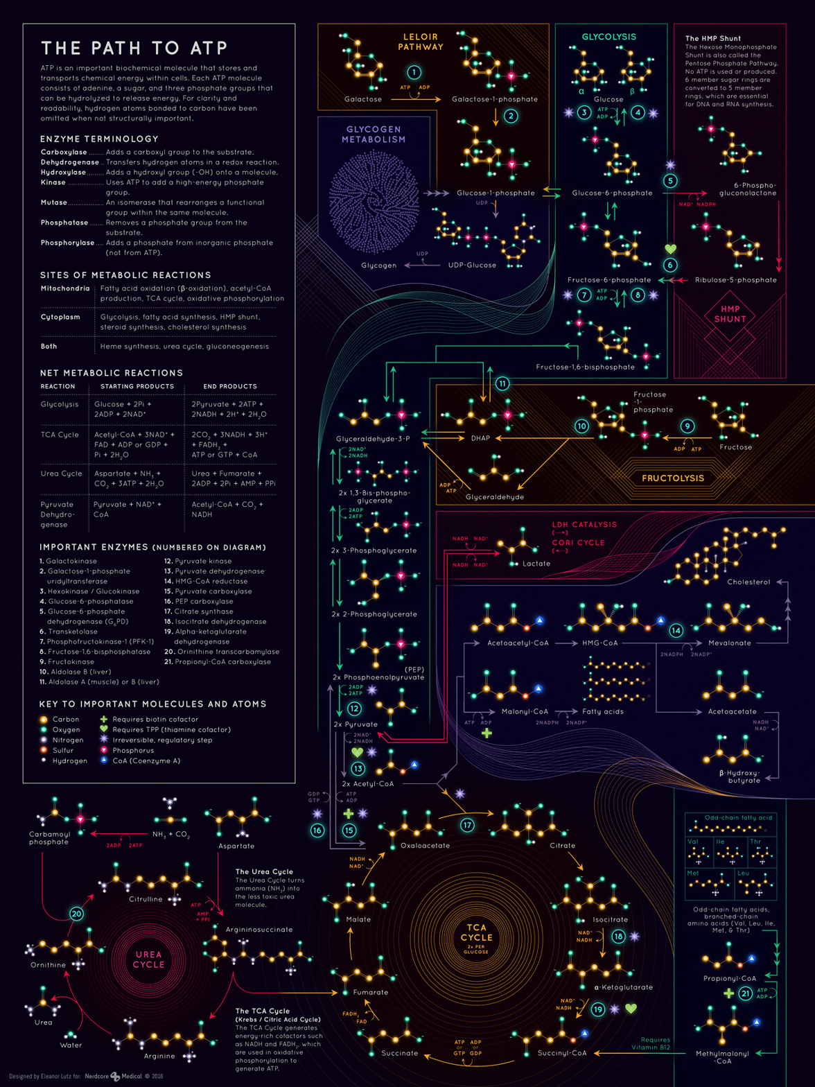
This week’s infographic is a metabolic map - a diagram of the chemical reactions that turns food into energy. The “galaxy of molecules” illustrates only a small fraction of the full metabolic map, but it includes some of the most common pathways taught in undergrad biochemistry or medical school. The project brief was to collect each of these major pathways into one resource that could serve as both a study guide and decorative poster.
I have a hard time picturing very small things (like molecules) and very large things (like galaxies), so I’ve always felt that they occupy a similar conceptual place in my head. I thought it would be fun to play off of that idea and illustrate extremely small molecules in the visual style of extremely large star clusters.
I actually designed this almost two years ago as one of my first collaborations with Nerdcore Medical. So this was a good opportunity to publish something with a few year’s worth of perspective. I think if I were to redo this poster today I’d try to add a little more distinction between each atom in the key. It’s difficult to make something visually interesting as well as easy to understand, and I think this particular style might have fallen too far on the visual side. But still, this is probably the most scientifically challenging infographic I made for Nerdcore Medical, and I’m happy with how it turned out.
-
Sources
- Thank you to Tyler Smith, PhD student in the Department of Molecular Biophysics and Biochemistry (Yale University), for fact-checking the finished infographic.
- Reference texts: First Aid for the USMLE Books 1 & 2 (2015), Tao Le and Vikas Bhushan. © 2014 McGraw-Hill Education. Organic Chemistry, 8th Edition, Francis A. Carey and Robert M. Giuliano. © 2011 by the McGraw-Hill Companies Inc.
- Fonts: Quicksand Bold and Regular, by Andrew Paglinawan.
© This work is owned by Nerdcore Medical. Please email Eleanor Lutz for press & design questions, and Arun Mathews for business & resale inquiries.