Immunology pop art
October 5 2016 · A collaboration with Nerdcore Medical
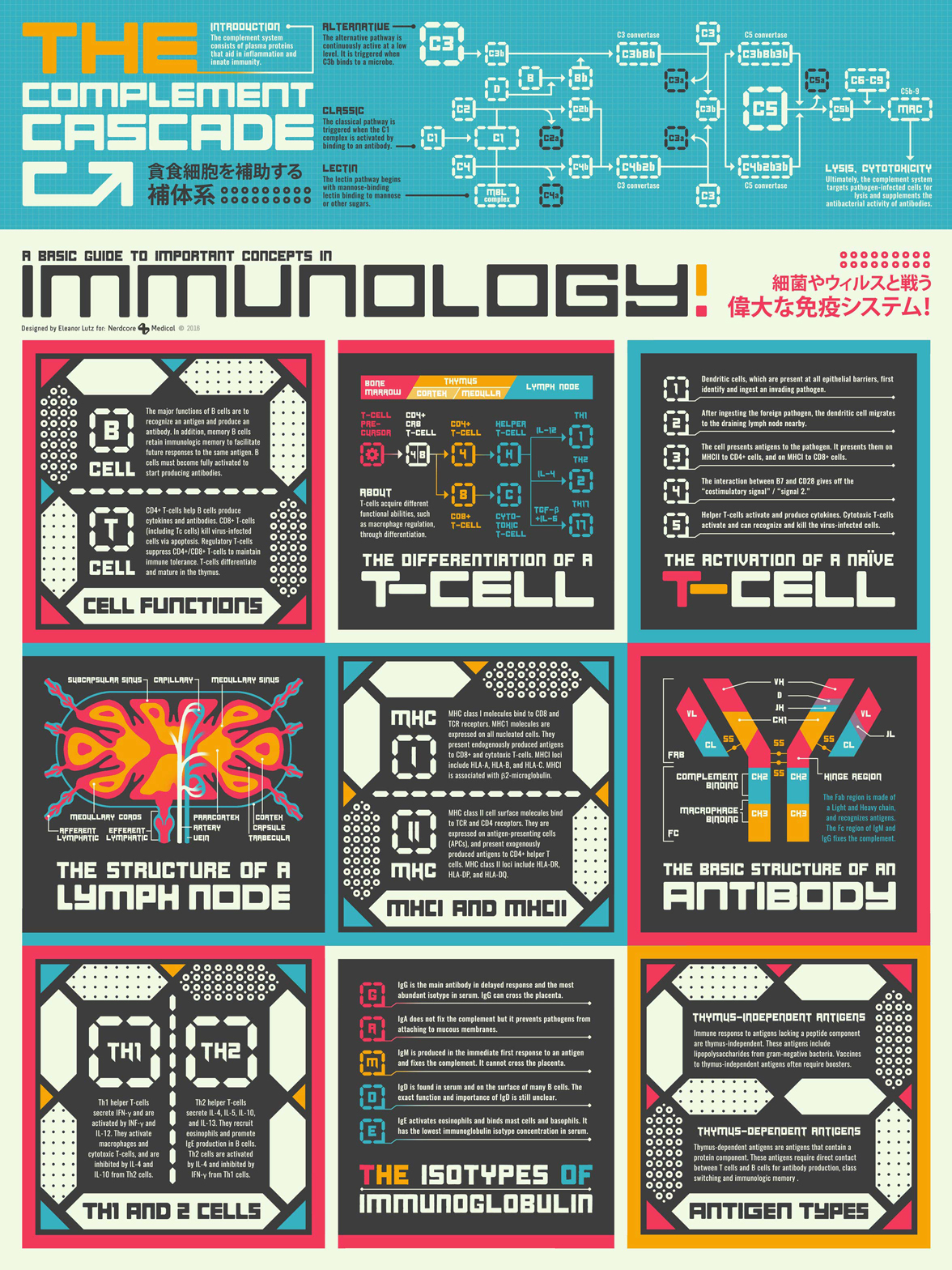
This week’s collaboration with Nerdcore Medical was inspired by a mashup of Japanese pop art and the old-school gamer style of Designer’s Republic. Pop art is usually a little too bright for me, but I ended up really liking the style when mixed with science and a 80’s video game vibe. I also love the dull green-gray-white pop art inspired color I found for the background of the poster.
The infographic itself is an introduction to the human immune system. It’s fairly text heavy but there’s also some chemistry reaction diagrams and two anatomical illustrations. My favorite part of the poster was figuring out how to make a lymph node and an antibody look like something that would belong in a video game.
A lot of my collaborations with Nerdcore Medical are pastiche projects like this one, where I co-opted old graphic design styles for new infographics. It was a great opportunity to learn to design in different styles, and I think it also helped keep the project fresh after so many iterations of medical infographics.
-
Sources
- First Aid for the USMLE Books 1 & 2 (2015). Tao Le and Vikas Bhushan. © 2014 McGraw-Hill Education.
- Fonts: Origicide by Koczman Bálint and Oswald Medium by Vernon Adams
© This work is owned by Nerdcore Medical. Please email Eleanor Lutz for press & design questions, and Arun Mathews for business & resale inquiries.