The architecture of the spine
October 12 2016 · A collaboration with Nerdcore Medical
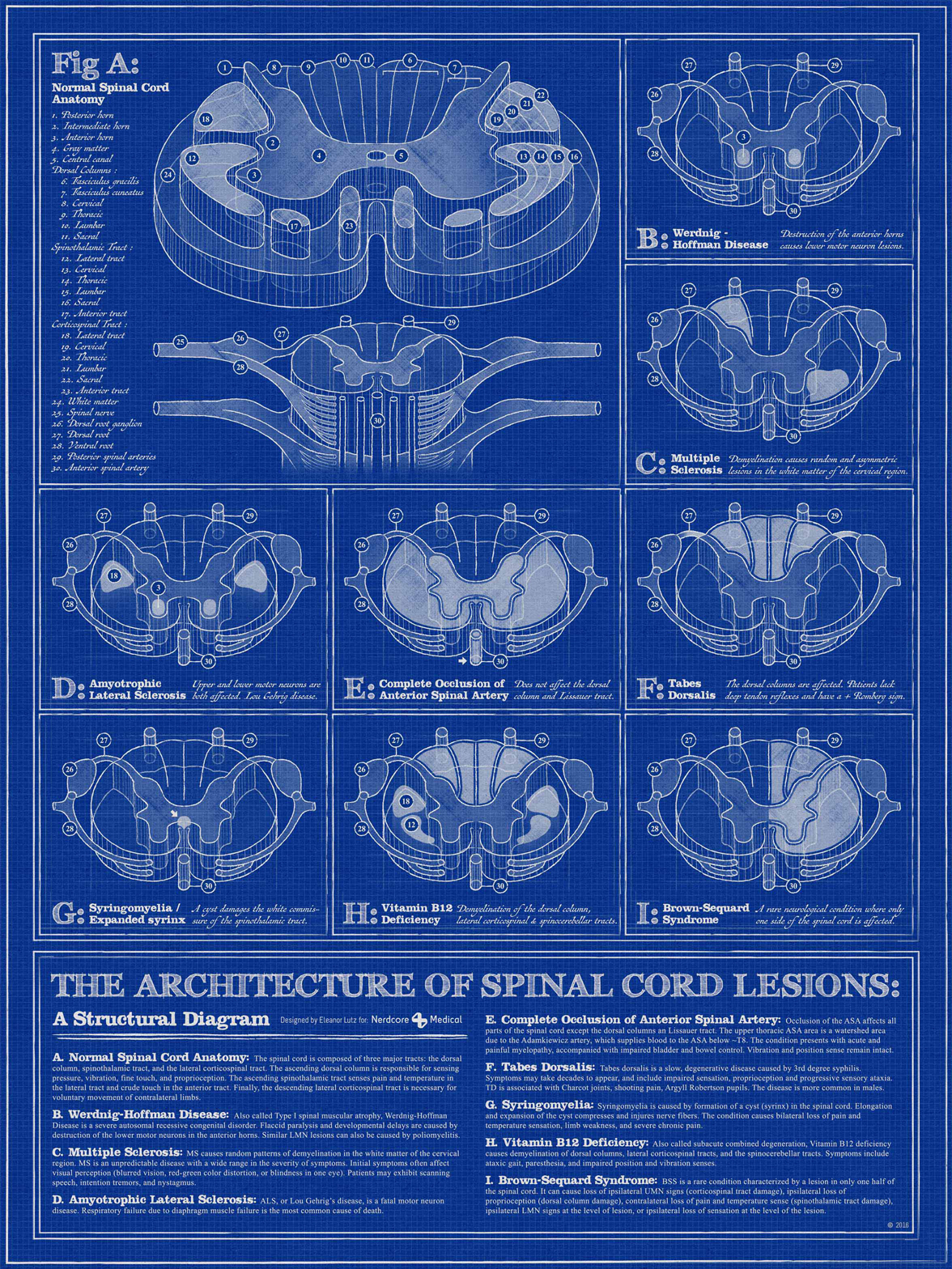
This week’s medical infographic poster is a diagram of spinal cord lesions. The spinal cord section diagrams in my reference books had a really interesting structural style, so I decided to design the poster with an architectural theme to show off all of the 3D section shapes.
A couple months after I finished this poster I took a human neuroanatomy class in grad school. So I actually got to pick up a real human spinal cord and look at all of the different sections. The most surprising part to me was the size - the spinal cord was only half an inch thick at the thickest part. I guess I expected it to take up more space, considering all of the information carried inside.
The memorization for that class was pretty time-consuming, but it was amazing to hold a real human brain in my hand and point out the sections that held all of that person’s memories, or their ability to speak. I think it’ll always be one of my favorite classes.
This “architectural sketch” style was done using the Beautiful Mess Illustrator vector brush set by Pixelwise. I bought the brush set on a whim, so it was an unexpected surprise when they turned out to be exactly what I needed for this project.
The fonts are Antiquarian Scribe by Brian Willson and FFF TUSJ by Magnus Cederholm. I’m slowly building my library of handwriting fonts, so if you have a favorite I’d love to hear which ones you use!
-
Sources
- First Aid for the USMLE Books 1 & 2 (2015). Tao Le and Vikas Bhushan. © 2014 McGraw-Hill Education.
- NIH and National Institute of Neurologic Disorders articles on multiple sclerosis, spinal muscular atrophy, tabes dorsalis information, amyotrophic lateral sclerosis (ALS), syringomyelia, Brown-Sequard syndrome, and an anterior spinal artery syndrome case study.
© This work is owned by Nerdcore Medical. Please email Eleanor Lutz for press & design questions, and Arun Mathews for business & resale inquiries.