The Western Constellations
July 15 2019 · Link to the Open-Source Code
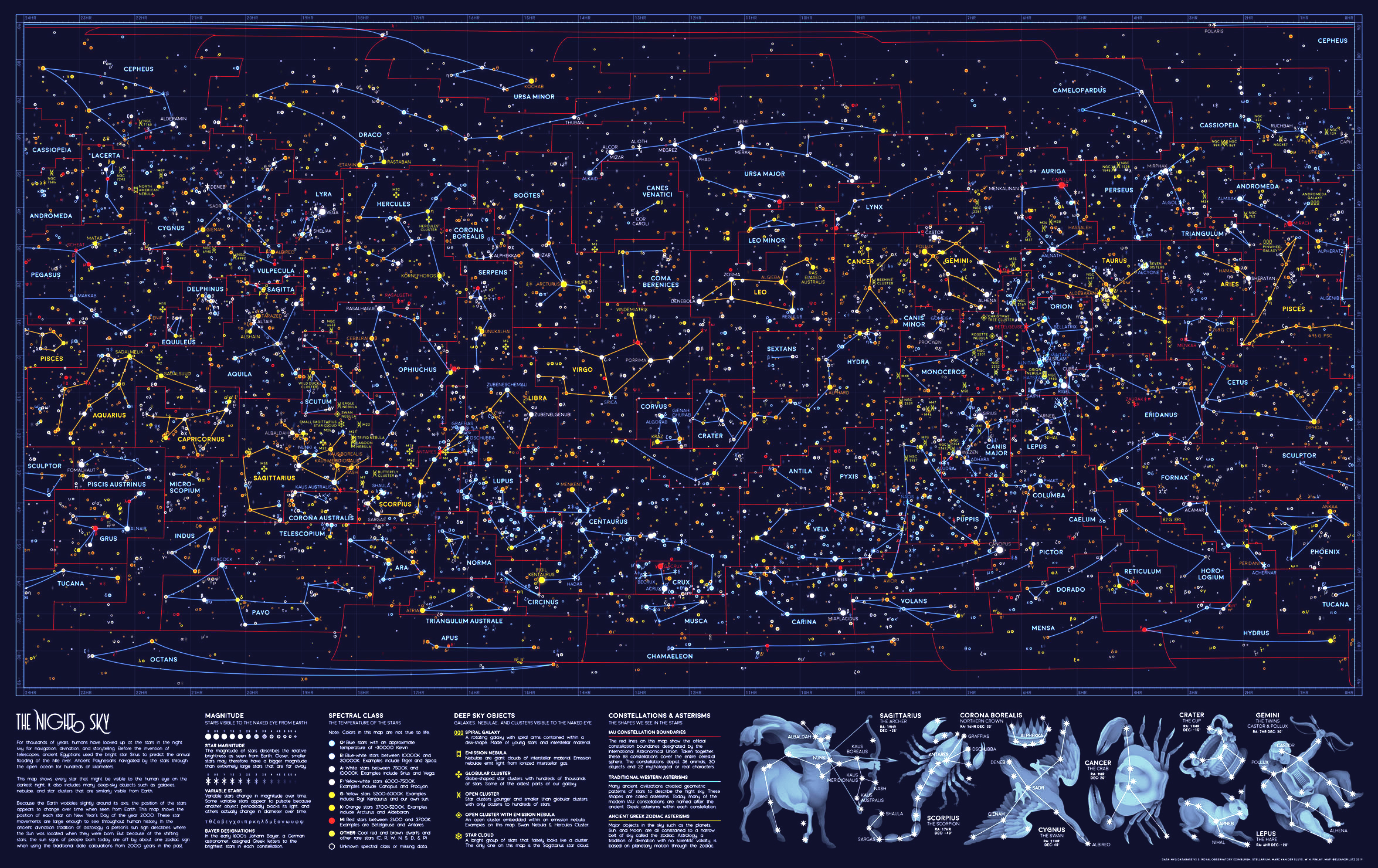
This week’s map shows every single star visible from Earth, on the darkest night with the clearest sky. The map also includes all of the brightest galaxies, nebulae, and star clusters from W.H. Finlay’s Concise Catalog of Deep-sky Objects. I illustrated the familiar Western star patterns - or asterisms - in blue and gold, as well as the scientific constellation boundaries in red.
Although the constellation boundaries are officially defined, asterisms are up for interpretation. So I actually used two different asterism datasets: Stellarium for the central map, and Western Constellation Lines by Marc van der Sluys for the illustrations in the bottom right corner. I thought it was interesting to show the range of interpretations for the same shapes (Sagittarius and Lepus are particularly unique across the two datasets).
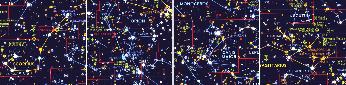
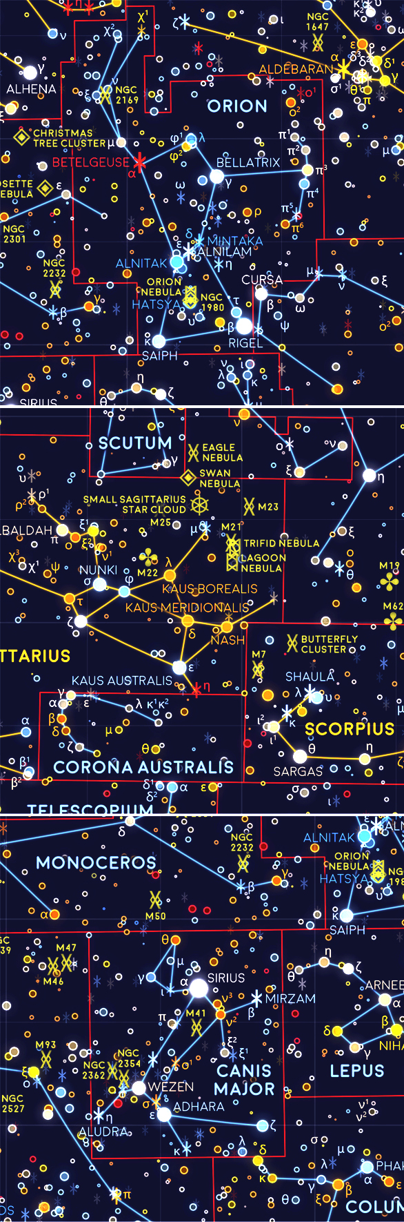 Some of my favorite sections of the finished map. Orion and Canis Major were particularly difficult to label, because there were so many galaxies and stars all clustered around the same place in the sky. The tiny Greek letters next to the brightest stars are Bayer designations - stellar identifiers often used to label stars. After plotting all of these different elements in Python, I tweaked the label positions in Illustrator and added a glow effect in Photoshop to make the map look like the night sky.
This map plots the size of each star based on its magnitude, or the relative brightness as seen from Earth. Star magnitude doesn’t measure the actual size of the star, so it’s possible for a small star to have a larger magnitude than a massive star if the smaller star is closer to Earth. The star colors are somewhat close to the true colors, but they’re exaggerated to make the difference between similar stars easier to see on the dark background.
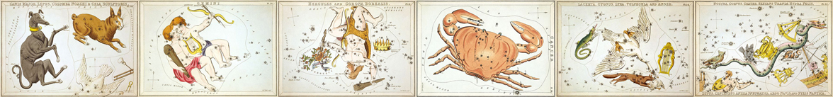
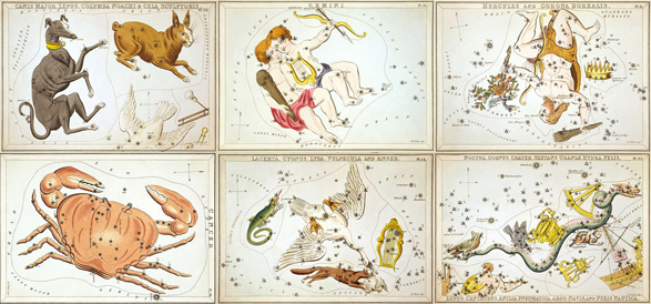 To illustrate the constellations shown on the bottom of the map, I used the 1824 card series Urania’s Mirror as a reference. The original engraved constellation cards were punched with small holes so that each star appeared to shine when the cards were held up to a light.
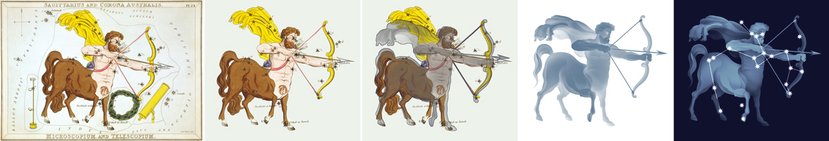
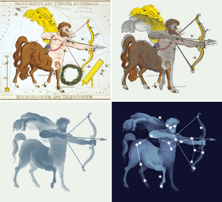 To update these illustrations from Urania’s Mirror, I first mapped each constellation using the modern HYG star database. Then I adjusted pieces of the Urania’s Mirror illustrations to fit next to the modern star alignments. I also increased the contrast between shapes and removed some confusing details, like the quiver on the centaur’s back in this example. The full-size map already shows the actual magnitudes of each star, so I decided to use a more artistic style for these illustrated stars. Each star is drawn as a sunburst with many rays, and the stars are all the same size so the constellation pattern is easier to see against the illustrated background.
-
Sources
- Data: Concise Catalog of Deep-sky Objects. W.H. Finlay. © 2003 Springer. Urania's mirror, or, A view of the heavens. Richard Rouse Bloxam, Sidney Hall, and Jehoshaphat Aspin. © 1824 Samuel Leigh. Unicode Character Table. © 2019 Sergei Asanov and Oleg Grigoriev. Stellarium. © 2019 version 0.19.0. HYG Database version 3. © 2019 David Nash. Western Constellation Lines. © 2005 Marc van der Sluys. Catalogue of Constellation Boundary Data. A.C. Davenhall and S.K. Leggett. © 1989 Royal Observatory Edinburgh. Used with permission. Reference texts: Astronomy, Andrew Fraknoi, David Morrison, Sidney C. Wolff et al. © 2016 OpenStax. Fonts: The labels on this map are typeset in Moon by Jack Harvatt. The title font is RedFlower by Type & Studio. Advice: Thank you to Oliver Fraser, Marc van der Sluys, Chloe Pursey, and Leah Willey for their helpful advice in making this map.
An Animated Map of the Earth
July 8 2019 · Link to the Open-Source Code
This is one of the very few animated maps I made for my space cartography project! NASA publishes many Earth datasets at monthly time scales, and this GIF uses one frame per month to show the fluctuating seasons. The animation focuses mainly on data about Arctic sea ice and vegetation, but it was hard to choose - NASA has many other beautiful seasonal datasets, like fire, temperature, or rainfall.
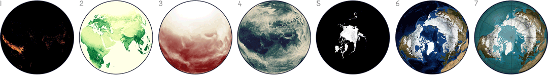
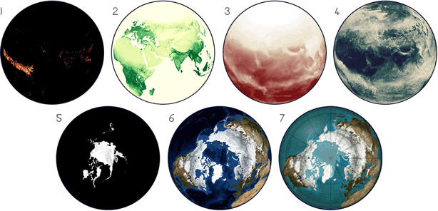 The NASA Earth Observations website includes data on seasonal fire incidence (1), vegetation (2), solar insolation, or the amount of sunlight (3), cloud fraction (4), North Pole ice sheet coverage (5), and processed satellite images (6). My own map (7) combines the ice sheet data and the Blue Marble satellite images. The NEO database also has many more interesting datasets not shown here, like rainfall, chlorophyll concentration, or Carbon Monoxide.
To match the rest of the space map collection, I decided to emphasize the natural features of the Earth. So I didn’t include any country borders, country names, or other political information (though I did include large cities because I thought they counted as interesting physical features). Instead I tried to use colors and labels that emphasized the capes, oceans, deserts and forests of the world. I also used the bottom two corner maps to show the changes in cloud cover and temperature throughout the year.
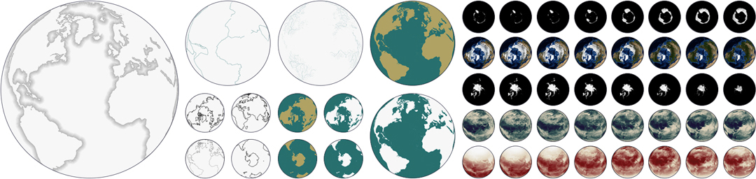
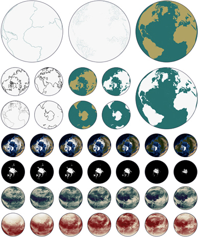 In addition to data from NASA, I also used outlines and labels from Natural Earth. Natural Earth is a public domain map dataset with many useful features, and for this animation I used Natural Earth coastlines and labels for cities, ice sheets, lakes, and other large natural areas. I also used data from the USGS to map the Earth’s tectonic plates.
As an unrelated note, I’ve also gotten several emails asking for high-resolution digital wallpapers of my space maps - so here they are! These are completely free, and you can download the ZIP files of five different wallpapers for 4:3 resolution, 16:9, 16:10, and double monitors.
-
Sources
- Data: Blue Marble: Next Generation Topography and Bathymetry © 2004 NASA Earth Observations. Sea Ice Concentration and Snow Extent, Global (1 Day - SSM/I/DMSP) © 2017 NASA Earth Observations. Cloud Fraction (1 Month - AQUA/MODIS) © 2018 NASA Earth Observations. Solar Insolation (1 Month) © 2018 NASA Earth Observations. Earth True Color (1 Day - NPP/VIIRS) © 2019 NASA Earth Observations. Natural Earth 1:10m Cultural Vectors Populated Places © 2019 Natural Earth v4.1.0. Natural Earth 1:10m Physical Vectors River Centerlines © 2019 Natural Earth v4.1.0. Earth In Depth © 2019 NASA Science Solar System Exploration. Earth's Atmospheric Layers © 2010 USGS Spatial Services. Tectonic Plate Boundaries © 2019 . Reference texts: Astronomy, Andrew Fraknoi, David Morrison, Sidney C. Wolff et al. © 2016 OpenStax. Fonts: The labels on this map are typeset in Moon by Jack Harvatt. The title font is RedFlower by Type & Studio. Advice: Thank you to Chloe Pursey and Leah Willey for their helpful advice in making this map.

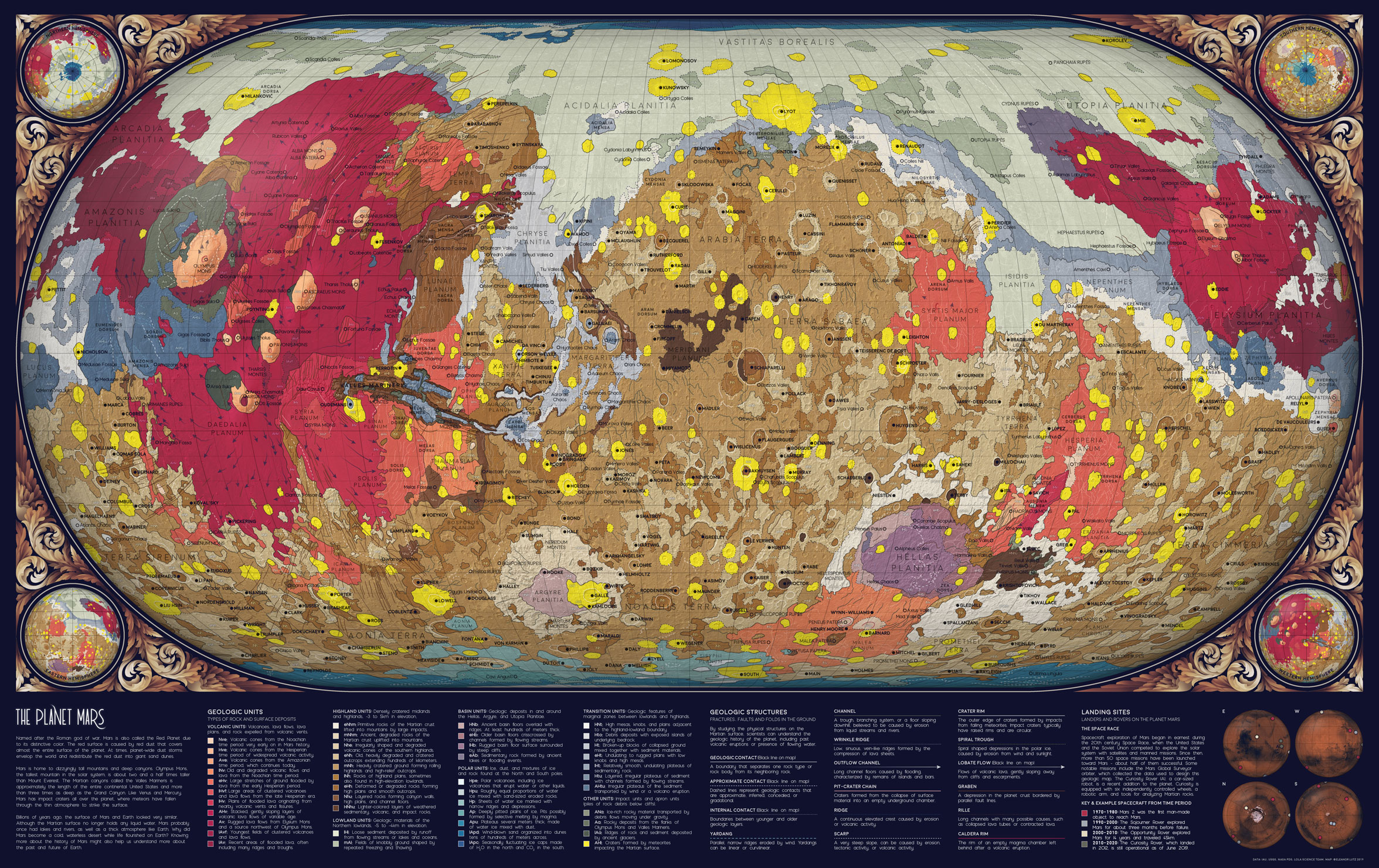
The Geology of Mars
June 24 2019 · Link to the Open-Source Code
This week’s map is an artistic rendition of the geologic map of Mars designed by the USGS. I used the same geology data as the original map, but I added more topographic and label data, redesigned the visual style, and also edited the key for a more general audience.
One of the most difficult parts of making this map was translating the key into plain English. The original USGS map was designed for geologists, so I had to look up almost all of the vocabulary. For example, my abbreviated definition for a caldera rim was “The rim of an empty magma chamber left behind after a volcanic eruption.” The original description was “Ovoid scarp, outlines single or multiple coalesced partial to fully enclosed depression(s); volcanic collapse, related to effusive and possibly explosive eruptions.”
In many cases my translated labels were approximate or less informative than the original, so I decided to also include the original acronyms for each type of geologic unit. These labels can be cross-referenced to the original data to learn more about each type of geologic formation in scientific terms.
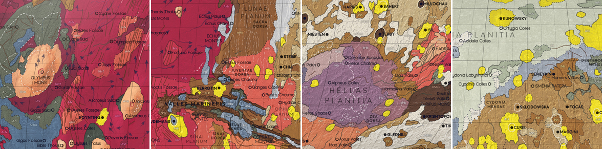
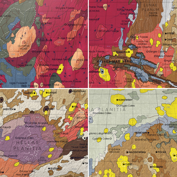 Some of the distinctive geologic features on Mars. 1: Olympus Mons, the largest volcano in the Solar System. 2: Valles Marineris, a deep canyon system more than 4000km long. 3: Hellas Planitia, the largest visible impact crater in the Solar System. 4: Mars is divided geologically into the Northern lowlands (pale green) and Southern highlands (brown). Impact craters formed by colliding asteroids and comets (neon yellow) are scattered across the planet.
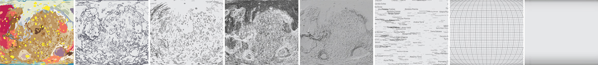
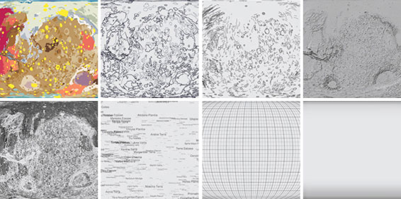 The individual layers used to make this map. 1-3: Geologic units, geologic contacts, and geologic features from the USGS dataset. 4-5: Hillshade and slope from a different USGS elevation dataset. 6: Nomenclature from NASA IAU. 7-8: Gridlines and a custom 3D effect designed in Photoshop.
I also spent a long time trying out different map projections for this design. I wanted to accurately show how much of the planet was made up of each geologic formation, so in the end I decided to use an Eckert IV equal-area projection. This type of map distorts object outlines, but it preserves the relative area of shapes across the globe. Eckert IV is not great for visualizing the polar regions, so I also added four inset maps to the corners to show each hemisphere of Mars (North, South, East, and West).
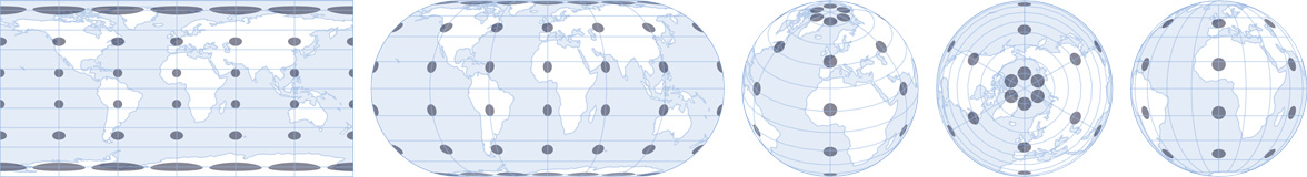
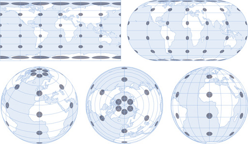 To map a 3D object in 2D space, the surface must be transformed using a map projection. There are many different projections, and for the maps in the Atlas of Space series I used Eckert IV, Orthographic, and Plate Carrée projections. To compare these different map projections, you can use a Tissot’s indicatrix - a set of circles of the same size plotted at different places on the globe. All map projections distort space, but you can see that the effects are quite different depending on the projection. 1: Plate Carrée. 2: Eckert IV. 3-5: Orthographic projections centered at different longitudes and latitudes.
-
Sources
- Data: Gazetteer of Planetary Nomenclature, International Astronomical Union (IAU). © 2019 Working Group for Planetary System Nomenclature (WGPSN). Planetary Symbology Mapping Guidelines, Federal Geographic Data Committee. Mars HRSC MOLA Blended DEM Global 200m v2. © 2018 NASA PDS and Derived Products Annex. USGS Astrogeology Science Center. Geologic Map of Mars SIM 3292. Kenneth L. Tanaka, James A. Skinner, Jr., James M. Dohm, Rossman P. Irwin, III, Eric J. Kolb, Corey M. Fortezzo, Thomas Platz, Gregory G. Michael, and Trent M. Hare. © 2014 USGS. Viking Global Color Mosaic 925m v1. © 2019 NASA PDS. Missions to Mars. © 2019 The Planetary Society. Reference texts: Astronomy, Andrew Fraknoi, David Morrison, Sidney C. Wolff et al. © 2016 OpenStax. Fonts: The labels on this map are typeset in Moon by Jack Harvatt. The title font is RedFlower by Type & Studio. Advice: Thank you to Henrik Hargitai, Oliver Fraser, Thomas Mohren, Chris Liu, Chloe Pursey, and Leah Willey for their helpful advice in making this map.