How to build a human II
December 21 2016 · A collaboration with Nerdcore Medical
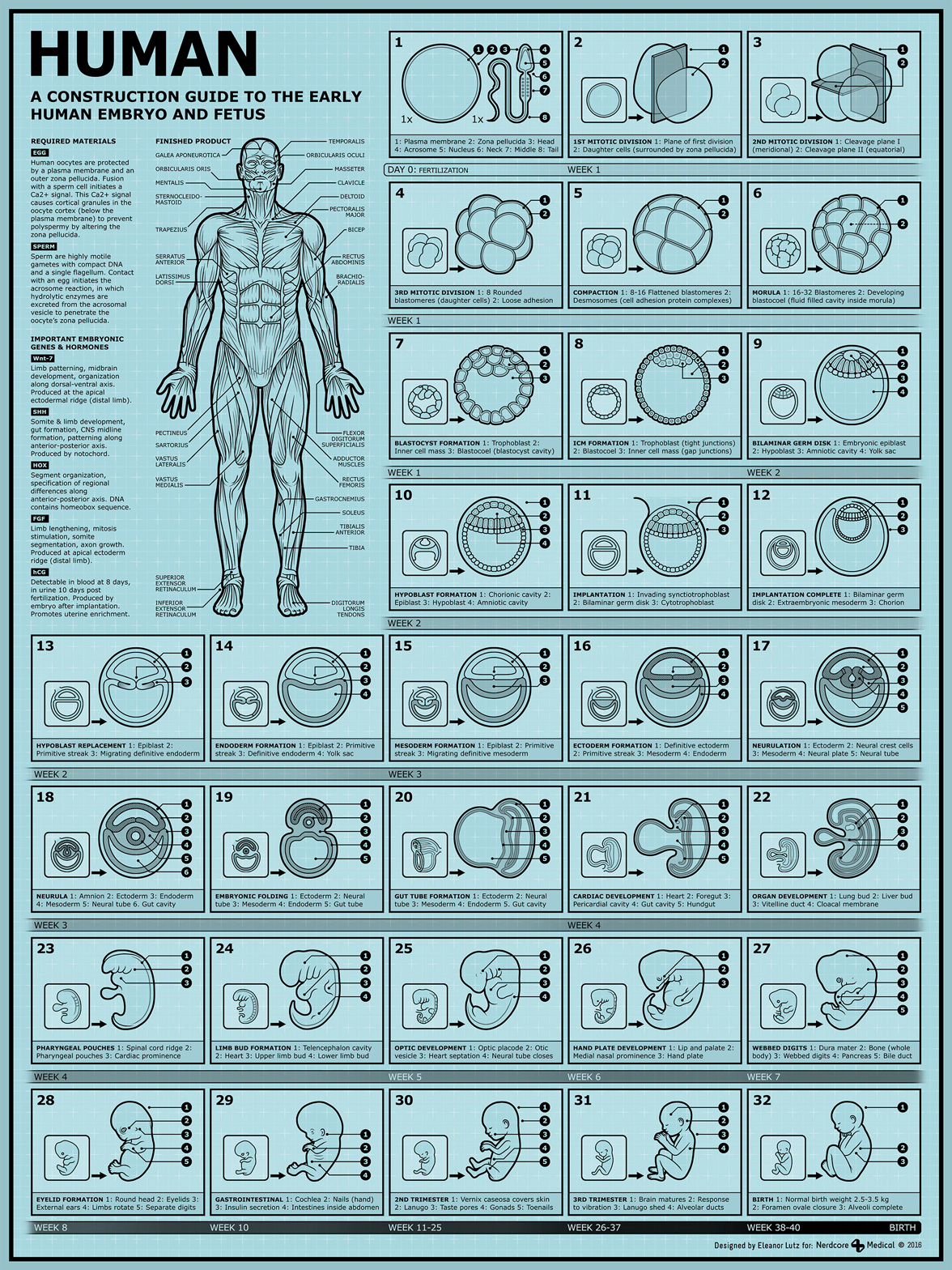
This week’s infographic is a new, improved version of my old How to build a human design. My goal for this project was to explain human embryo development in an engaging and informative way. I love image-based graphics like airplane safety information cards and IKEA construction guides, and I decided to emulate the style for this infographic. I wanted anyone to be able to understand the process from just the visual information on the page.
Although I added medical terms to each image caption, they’re meant as a supplement rather than a necessary part of the design. I think that including technical terms alongside visual information helps make the project useful to a larger group of people.
Readers with a background in medicine can look up the terms to learn more or use this as a study guide, and people without medical experience can still use the visuals to understand all of the anatomical changes.
It was great to get the chance to update something I made two years ago. The original illustrations were a little smaller than I wanted, and I focused too much on the animation. This new version is less colorful but I think it’s both more accurate and better designed. I re-made every one of the original drawings and added many more steps in the process. I also added a “finished product” image of an adult human, with help from stock reference images.
As with my other medical infographics, Dr. Arun Mathews, a Chief Medical Officer in Texas, fact-checked my work and suggested useful articles.
-
Sources
- First Aid for the USMLE Books 1 & 2 (2015). Tao Le and Vikas Bhushan. © 2014 McGraw-Hill Education. Embryonic folding and flexion of the embryo. Ben Pansky. Review of Medical embryology book. Sections on sperm, eggs, and fertilization. Molecular Biolgy of the Cell. 4th Edition.
Leveling up
December 14 2016 · A collaboration with Nerdcore Medical
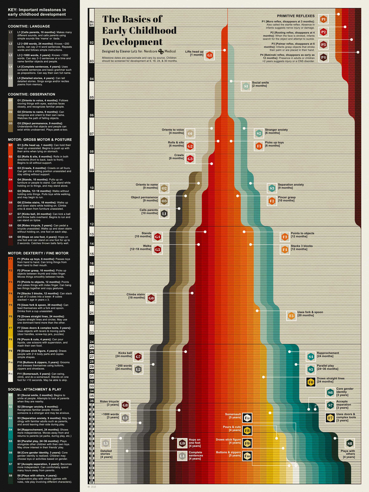
This week’s infographic is a design about child development. I wanted to create a easy-to-read guide that would be helpful for both medical students and new parents. The infographic has a quick summary of each developmental milestone on the right panel, and a more in-depth numbered overview on the left panel. The goal was to make a chart that would be both useful and visually interesting.
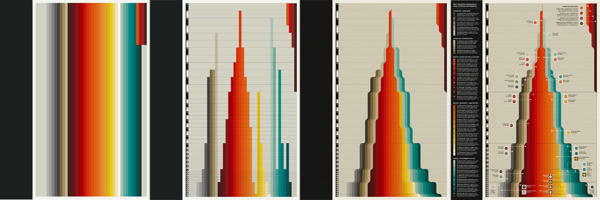
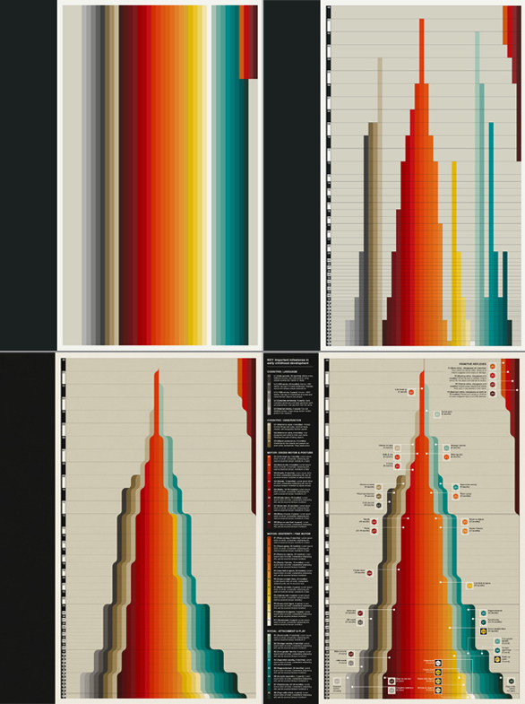 Since a lot development milestones depend on earlier skills, I decided to stack each skill onto all of the previous ones in a waterfall-style area graph. To make this design I first organized each of the child-development milestones and picked a gradient of colors to match each category (process images are shown above). Then I made a custom timeline and cut each milestone color line at the correct time point. Finally I shifted each of the timeline colors to the center so that the entire design looked like a waterfall. I debated for a while where to put the detailed descriptions for each development stage, but I finally settled on a left sidebar to keep things less cluttered in the main section.
One of the unique customizations of this design is the nonlinear timeline. A third of the developmental milestones happen within the first 12 months, and increasing the spacing for the first few years helped emphasize these earlier years of development.
As with my other medical infographics, Dr. Arun Mathews, a Chief Medical Officer in Texas, fact-checked my work and suggested useful articles.
-
Sources
- First Aid for the USMLE Books 1 & 2 (2015). Tao Le and Vikas Bhushan. © 2014 McGraw-Hill Education. Neural mechanism and clinical significance of the plantar grasp reflex in infants. Futagi et al. Pediatr Neurol. 2010 Aug;43(2):81-6. doi: 10.1016. CDC & NIH National Library of Medicine: Moro reflex, Babinski reflex, Important milestones: Your Child By Five Years.
- Fonts used: Abril Fatface by TypeTogether and Arial.
Heartbeats and murmurs
December 7 2016 · A collaboration with Nerdcore Medical
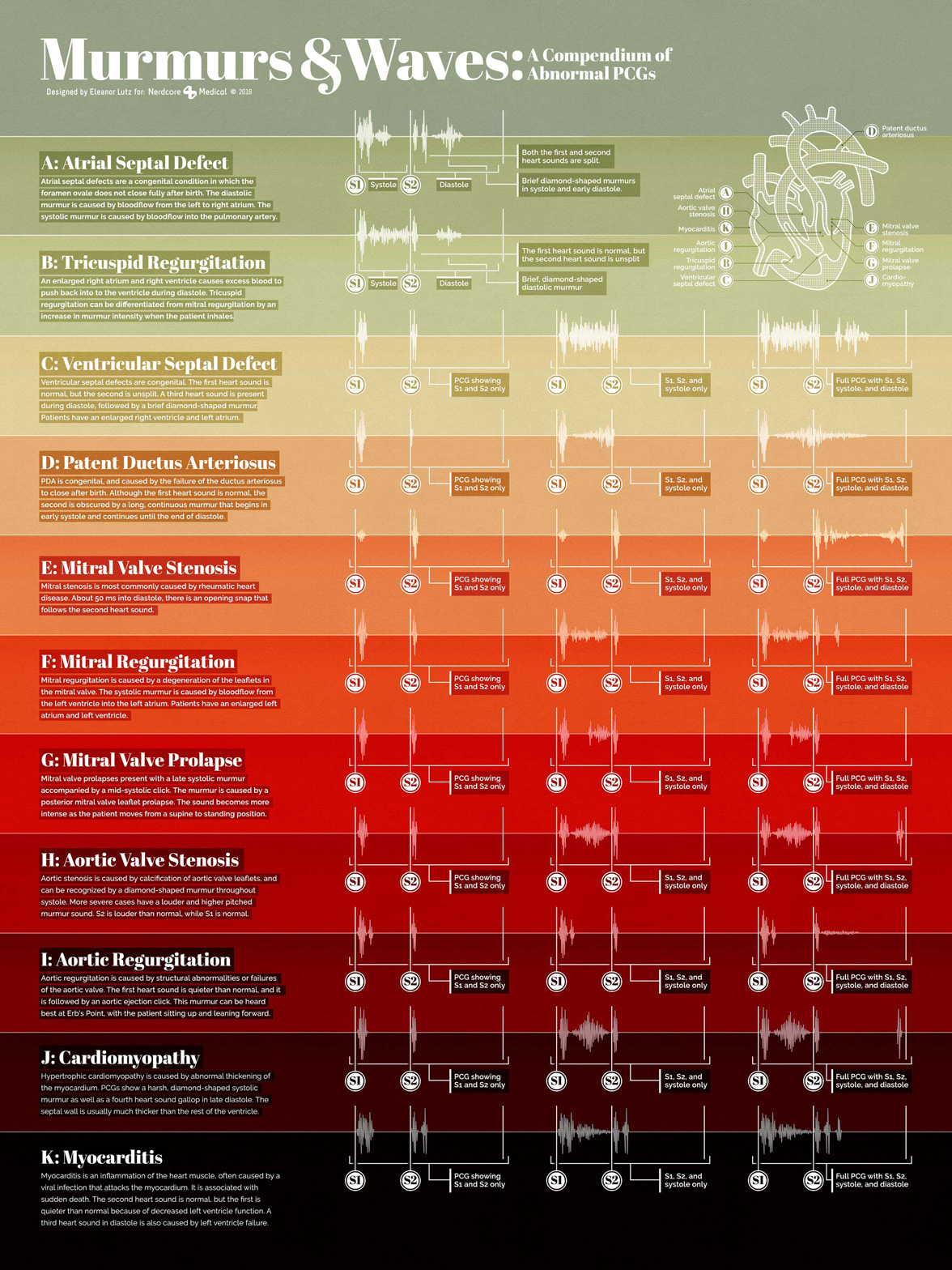
This week’s Nerdcore Medical collab is a paired poster for October’s Hearbeats and heart attacks poster. The last poster showed the EKG wave patterns of 10 different heart conditions, as well as the different parts of a normal EKG wave. This new poster shows the PCG patterns of 11 more heart-related diseases.
EKG waves (also called an ECG) shows the heart’s electrical activity, while a PCG uses a phonocardiograph to plot the sounds produced by the heart. So even though these two posters are made with similar design styles and fonts, the waves look completely different.
Since PCG waves can be a little more hard to decipher as a graphic, I replicated each wave three different times to show the various sections of the sound waves. The first heartbeat graphic shows just the S1 and S2 parts of the PCG wave. The second shows the S1 & S2 combined with the PCG systole sound, and the third wave illustrates the entire sound wave. I also included a small heart illustration showing the anatomical defects that cause each of the different diseases in the infographic.
-
Sources
- First Aid for the USMLE Books 1 & 2 (2015). Tao Le and Vikas Bhushan. © 2014 McGraw-Hill Education.
- Heart sounds and lung sounds © 2016 Medical Training and Simulation LLC.
- Patent ductus arteriosus. NIH U.S. National Library of Medicine.