An Animated Sketch of Jupiter
August 2 2019 · Link to the Open-Source Code
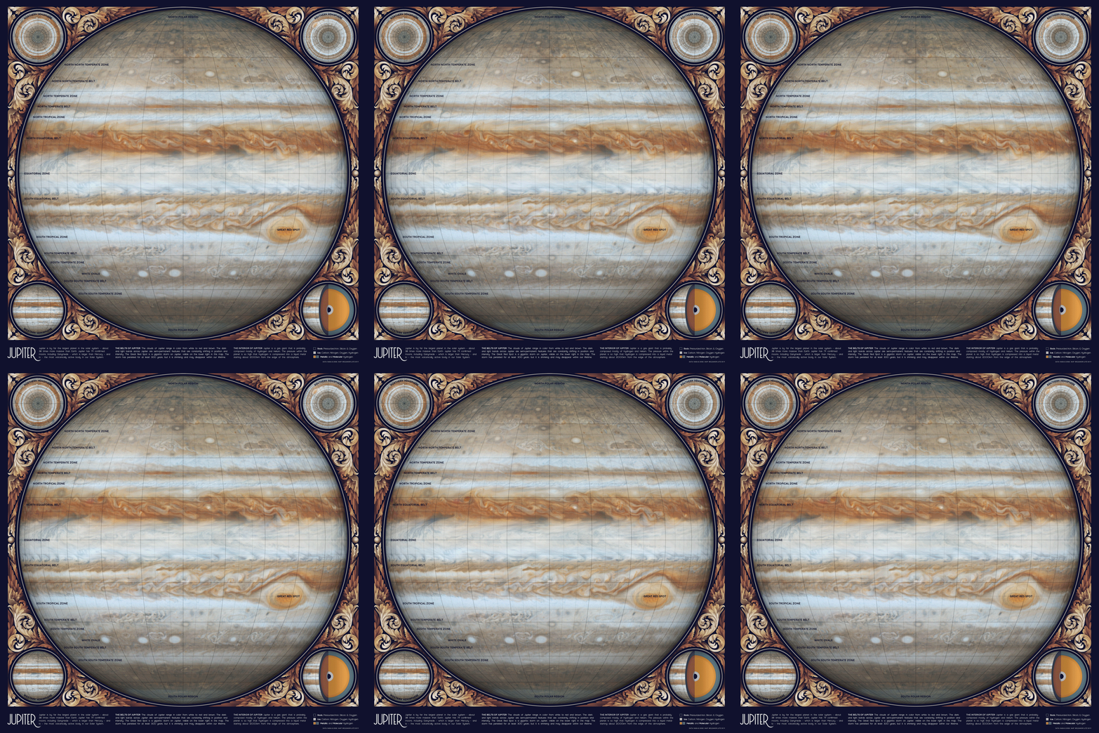
This week’s map is just for fun! The animated GIF illustrates the storms on Jupiter, but it’s an artistic drawing rather than an accurate representation of the clouds in real time. The majority of the work was done in Photoshop, based on images published from the Cassini spacecraft in 2000 and 2006.
At first I wasn’t planning to map Jupiter, because the surface is constantly changing. We also have much less information about the gas giants compared to the rocky planets closer to Earth. But then I found this awesome video of Jupiter’s clouds, and I decided to edit the film into a repeating cycle.
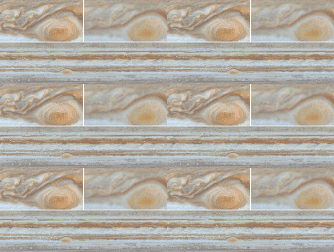
To make a more detailed design, l I used Cassini’s high-resolution Jupiter map as the background, and placed the lower resolution video on top as a semi-transparent layer. Cassini’s video doesn’t include any data for the North or South poles, so the very top and bottom of this map aren’t animated. You can probably see the discontinuity at about the second bolded latitude line (though it’s not too noticeable because of the low wind speed near the poles).

 The high-resolution version of Cassini’s Jupiter map (1) is much more detailed than the video version (2). I combined both of them together to get both detail and animation into the design. The original video doesn’t actually loop, but you can gradually fade the frames at the end of the movie to give the illusion of continuous flow. I also removed the occasional shadowy blotches cast by Jupiter’s moons, and edited the colors and contrast in the video to match the background image.
Although I labeled some of Jupiter’s cloud layers, the storms are constantly shifting and individual bands can move or change color over time. Even the Great Red Spot, a huge storm big enough to swallow the Earth whole, is gradually shrinking and could disappear within our lifetime.
-
Sources
- Data: PIA07783. Cassini's Best Maps of Jupiter (North Polar Map). © 2006 NASA, JPL, and the Space Science Institute. PIA07784. Cassini's Best Maps of Jupiter (South Polar Map). © 2006 NASA, JPL, and the Space Science Institute. PIA02863. Planetwide Color Movie. © 2000 NASA, JPL, and the University of Arizona. PIA07782. Cassini's Best Maps of Jupiter (Cylindrical Map). © 2006 NASA, JPL, and the Space Science Institute. Reference texts: Astronomy, Andrew Fraknoi, David Morrison, Sidney C. Wolff et al. © 2016 OpenStax. Fonts: The labels on this map are typeset in Moon by Jack Harvatt. The title font is RedFlower by Type & Studio. Advice: Thank you to Chloe Pursey and Leah Willey for their helpful advice in making this map.

© This work is shared under a Creative Commons Attribution-NonCommercial-NoDerivatives 4.0 International License.