How to build a human heart
This poster explains how a baby's heart develops while in the womb. It includes a mix of different conceptual elements - there are anatomical changes, molecular changes, and also some sections on basic anatomy.
Curative DesignDesigned by Eleanor Lutz for Nerdcore MedicalCurative Design is a set of 20 infographics designed for medical students. Our goal was to make beautiful, accurate posters that could be used as both a decoration and a study guide for the US medical licensing exams. Each poster uses a different style to explain the science in a visually appealing way. |
|---|
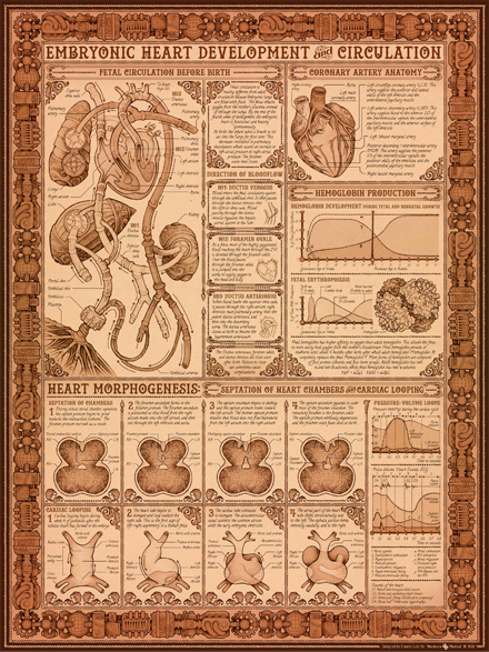
This poster explains how a baby's heart develops while in the womb. It includes a mix of different conceptual elements - there are anatomical changes, molecular changes, and also some sections on basic anatomy.
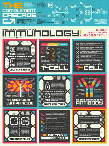
This poster is a basic introduction to the human immune system, presented in pop art style. Most of the information in this particular poster was in text form, so I wanted to use a bright, colorful style to add some visual interest.
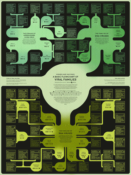
This infographic visualizes some of the most common viral species that infect humans. Since virus taxonomy isn't the same as other family trees (viruses aren't technically alive), I used a "blob-tree" to emphasize the nontraditional relationships between different virus families.
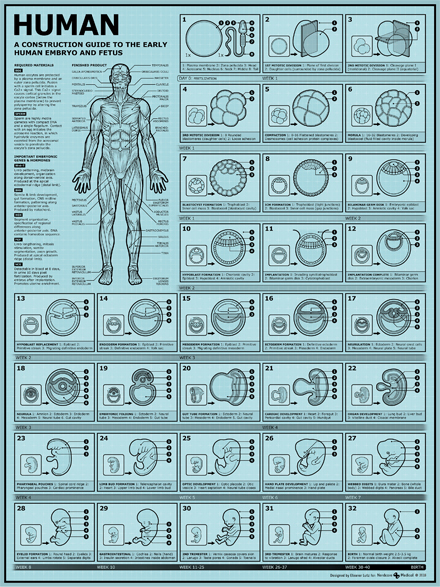
My goal for this poster was to explain human embryo developmemt in an engaging visual. This topic includes many graphic elements, so I wanted to draw attention to the illustrations without adding too many extraneous details.
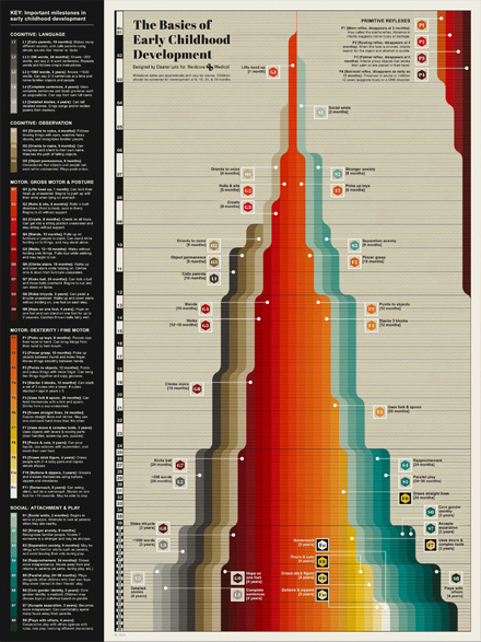
This infographic has two sections - a quick summary of each developmental milestone on the right panel, and a more in-depth numbered overview on the left panel. Since a lot of developmental milestones depend on earlier skills, I decided to stack each skill onto all the previous ones in a waterfall-style area graph.
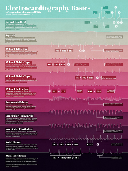
This poster introduces several heart diseases that can cause abnormal EKG readings. I wanted to highlight the unique shapes of each EKG wave as the focal point of the poster. After some experimenting, I decided on a simple color blocking style to emphasize the wave shapes and separate each section.
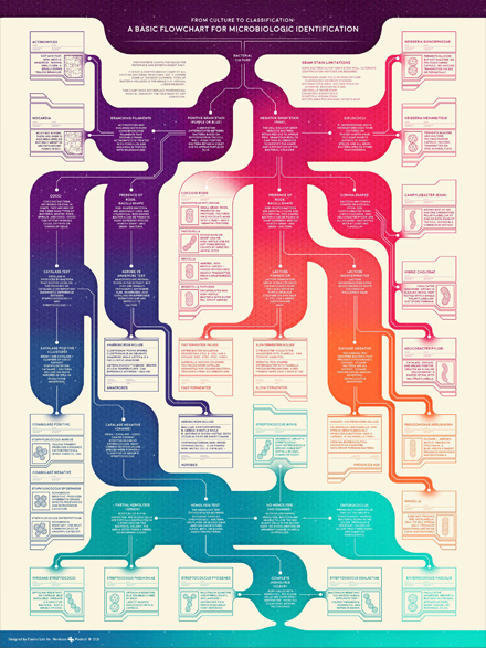
This poster is an ID guide to common bacterial infections in patients. The flowchart shows the steps you would take to identify a bacterial infection, and what each of the lab test results might mean.
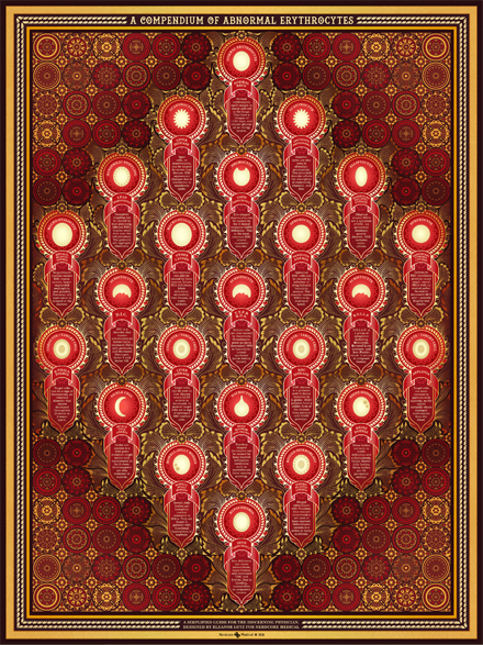
When I started this poster it was difficult to decide what to do with the simple shapes of each cell. The project requirements were to make infographics that were interesting at poster-size, and the simple shapes weren't engaging enough. In the end I decided to surround each shape in a decorative Rococo style.
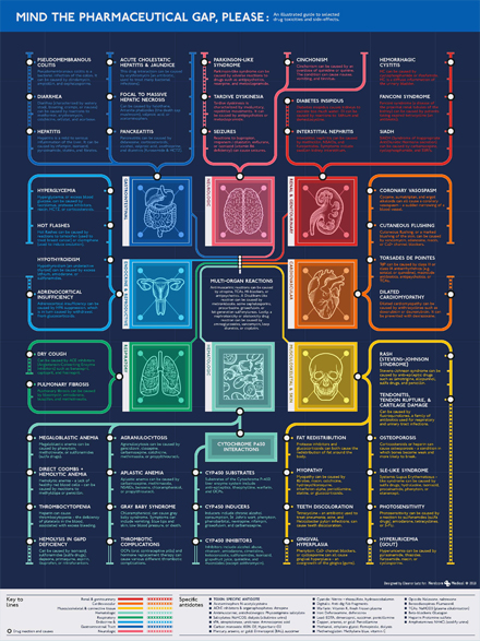
This poster explains the possible side effects of prescription drugs. Since most of the side effects were specific to an organ system, I decided to make a London tube map inspired design with "stops" for each of the different diseases. This layout looks at the information from a symptom-first perspective instead of looking at the drug first.
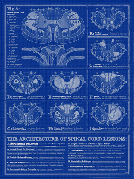
This poster diagrams several different kinds of lesions that can occur in the spinal cord. The graphic references for this poster reminded me of old Roman amphitheaters, so I decided to use a similar architectural style to show off all of the 3D sections.

This infographic poster explains common statistics terms that medical students would need to know. Since statistics is a little lacking in visual interest, I decided to use isometric drawings of people to humanize the equations and concepts.

This poster is a metabolic map - a diagram of the chemical reactions that turns food into energy. I have a hard time picturing very small things (like molecules) and very large things (like galaxies), so I've always felt that they occupy a similar conceptual space in my mind. I thought it would be fun to play off of that idea and illustrate molecules in the visual style of large star clusters.