Half past orange: A rainbow color clock
June 26 2016 · Link to the full-size color clock
This week’s post is a little less science and a little more design - it’s actually a side project I’ve been working on to practice R and Python.
I thought it would be fun to find an algorithm to define “what Eleanor thinks is a pretty color.” I think generative design is pretty cool, so the idea was to write something I could use to automatically pick colors for maps or vector patterns or graphs.
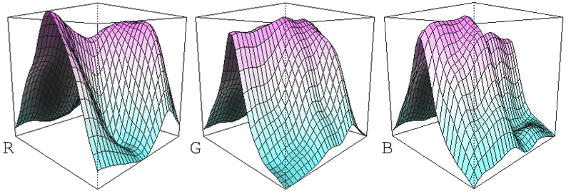
To define “pretty colors” I used R to fit adaptively smoothed splines to 264 colors I picked by hand. So that was a total of 792 data points - 264 for each RGB channel. (I thought about using CIELAB, but it was less intuitive for me to define “pretty colors” in LAB space).
These interlocking graphs describe every color I like, and none I don’t like:
 I’m still a beginner in R and Python, so this actually took a surprising amount of time. But I ended up learning a lot about different color spaces and the biology of human color vision.
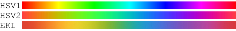
For example, I wanted to include a hue variable like the “H” in HSV. But HSV doesn’t account for the fact that human eyes aren’t equally sensitive across the color spectrum. So I manually adjusted my own scale to look more consistent.
A linear HSV (HSV1) has too much green and blue. A HSV sine wave (HSV2) is better, but still doesn’t have much yellow. For mine I got rid of the ugly neon colors and increased the amount of orange and yellow:
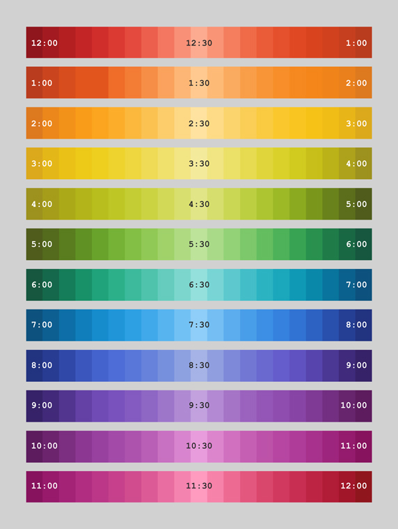
 To test out the finished algorithm I made a rainbow color clock. The clock cycles through the color wheel every 12 hours using only colors I like. So that means no neon colors, muddy yellows, extremely bright pastels, or artificial-looking colors like 100% blue.
The clock also changes brightness every hour so that the half-hour mark is the brightest and the hour-mark is the darkest. I wanted fairly basic rules so you could actually use the color to tell time.
The color names are pulled from Chirag Mehta’s Name that Color Javascript library. It’s an awesome open source tool that finds the closest named color in a huge database of color names. I think my favorite names are Mantis green and Meteorite purple.
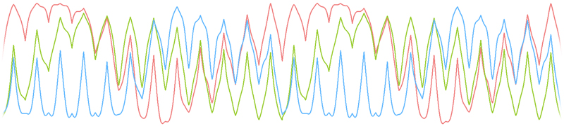
This is what the rainbow clock looks like in its original equation form. Each of the RGB channels oscillates up and down once an hour.
 The finished rainbow color clock lives here as a responsive web page. I think I’ll eventually laser-cut a plywood frame for my old phone so I can have a nice wall-mounted version in my office at work.
|
Virus trading cards
April 11 2016
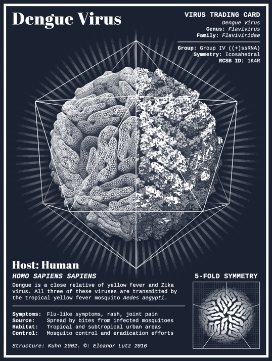
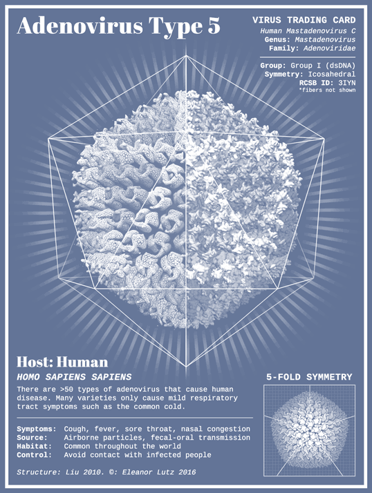
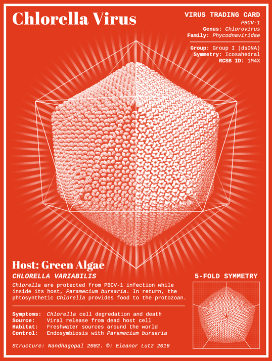
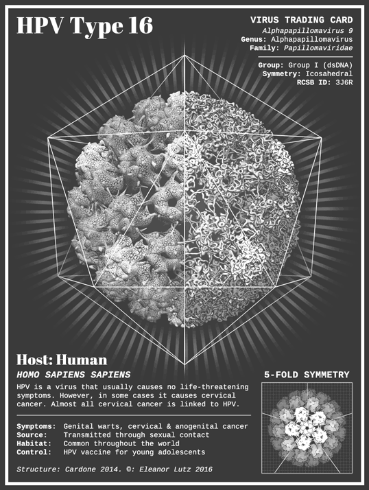
This week’s infographic is a set of virus trading cards! Viruses are surprisingly symmetrical, and I love them because they remind me of a biological version of snowflakes. Each trading card shows you the structure of the viral capsid - the protein shell protecting the genetic material inside a virus. I wanted to make a collection that showcased a variety of viruses that are a current public health concern.
I picked three human diseases that I thought would be particularly relevant - HPV (which causes cervical cancer), Adenovirus (which causes the common cold), and Dengue (a close relative of the Zika virus). Edit: The Zika virus structure was not known at the time. I also included Chlorella Virus (which infects a non-human host) to add more diversity to the trading card collection.
To make these cards I used UCSF Chimera, a molecular modeling program used by many researchers. When scientists discover a new protein structure, they upload it to the Worldwide Protein Data Bank. Each entry is assigned a unique ID number, which you can use to look at the 3D protein model in many different magnifications. In this set of virus trading cards, I decided to show each viral capsid at two different magnifications - a coarse version on the left and a finely detailed version on the right.
-
Sources
- Molecular Modeling: Molecular graphics and analyses were performed with the UCSF Chimera package. Chimera is developed by the Resource for Biocomputing, Visualization, and Informatics at the University of California, San Francisco (supported by NIGMS P41-GM103311).
- Other Sources: Dengue information and structure, HPV information and structure, Adenovirus information and structure, and PBCV-1 information and structure. Fonts used: Abril Fatface Regular by Veronika Burian and Jose Scaglione, Cousine Regular by Ascender Fonts.
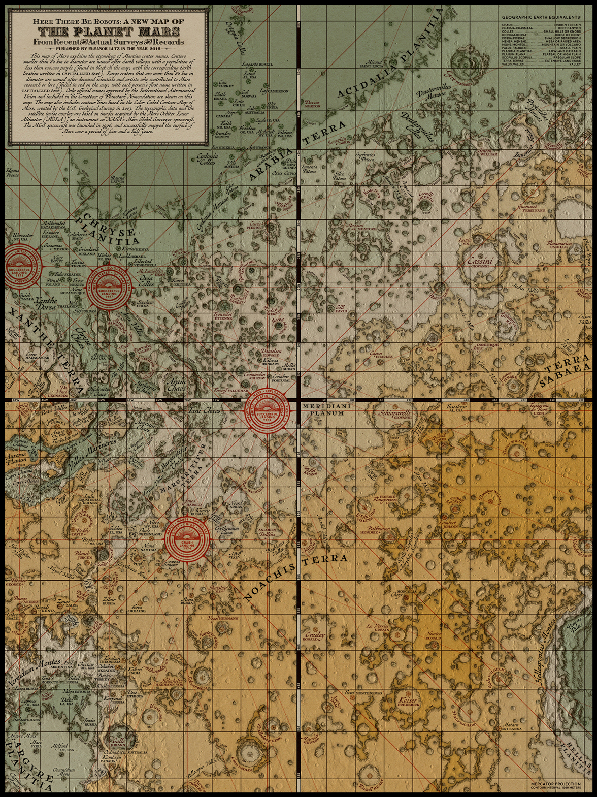
Here there be robots: A medieval map of Mars
February 27 2016
Although I’m not an astronomer, I love reading about Mars missions and looking through the free data released by NASA. This month I decided to create a map to showcase the wealth of knowledge scientists have accumulated over the past few decades.
Unlike other planetary maps, this map uses a Victorian style inspired by medieval cartographers. Victorian-style maps are from a time when most of the world remained a mystery, and travelers only knew about nearby lands. Now that people have mapped the entire globe, I think that Mars has taken over our collective imagination as the next mystery to explore. I wanted to use this thematic connection to tie together our history of exploration with our current adventures into unexplored lands.
To make this map I hand-traced topographic data from the USGS Color-Coded Contour Map of Mars to give the map a traditional aesthetic. The hand-traced topographic lines weren’t very exact, so I added an overlay of satellite imagery from the NASA Mars Orbital Laser Altimeter. I also used naming information from the Gazetteer of Planetary Nomenclature and location information from the Mars 1:5 million-scale THEMIS Images.
To add a little something extra, I wanted to share some of the interesting history behind the geographic features on Mars. For example, craters on Mars are named after Earth towns, scientists, or famous artists. In this map I tried to make a strange planet seem familiar by prominently sharing the Earth origins of each crater name.
-
Sources
- Cartography: Color-Coded Contour Map of Mars” USGS Astrogeology Science Center, 2003, “Gazetteer of Planetary Nomenclature” NASA, USGS Astrogeology Science Center, International Astronomical Union, “Mars 1:5 million-scale THEMIS Images” NASA, USGS Astrogeology Science Center, International Astronomical Union
- Fonts used: Moon Bold by Jack Harvatt, Chipperfield & Bailey by Paul Lloyd, Titania by Dieter Steffman, Antiquarian™ and Antiquarian Scribe™ by Brian Willson, and various elements cannibalized from old maps in the NY Public Library's Digital Collection (1, 2, 3).