Rough drafts and sketches: EKG Infographic
October 20 2016 · See the original infographic
Yesterday I published a sunrise-inspired infographic about human heartbeats. I thought I’d make a quick follow-up blog post taking you behind the scenes on the project.
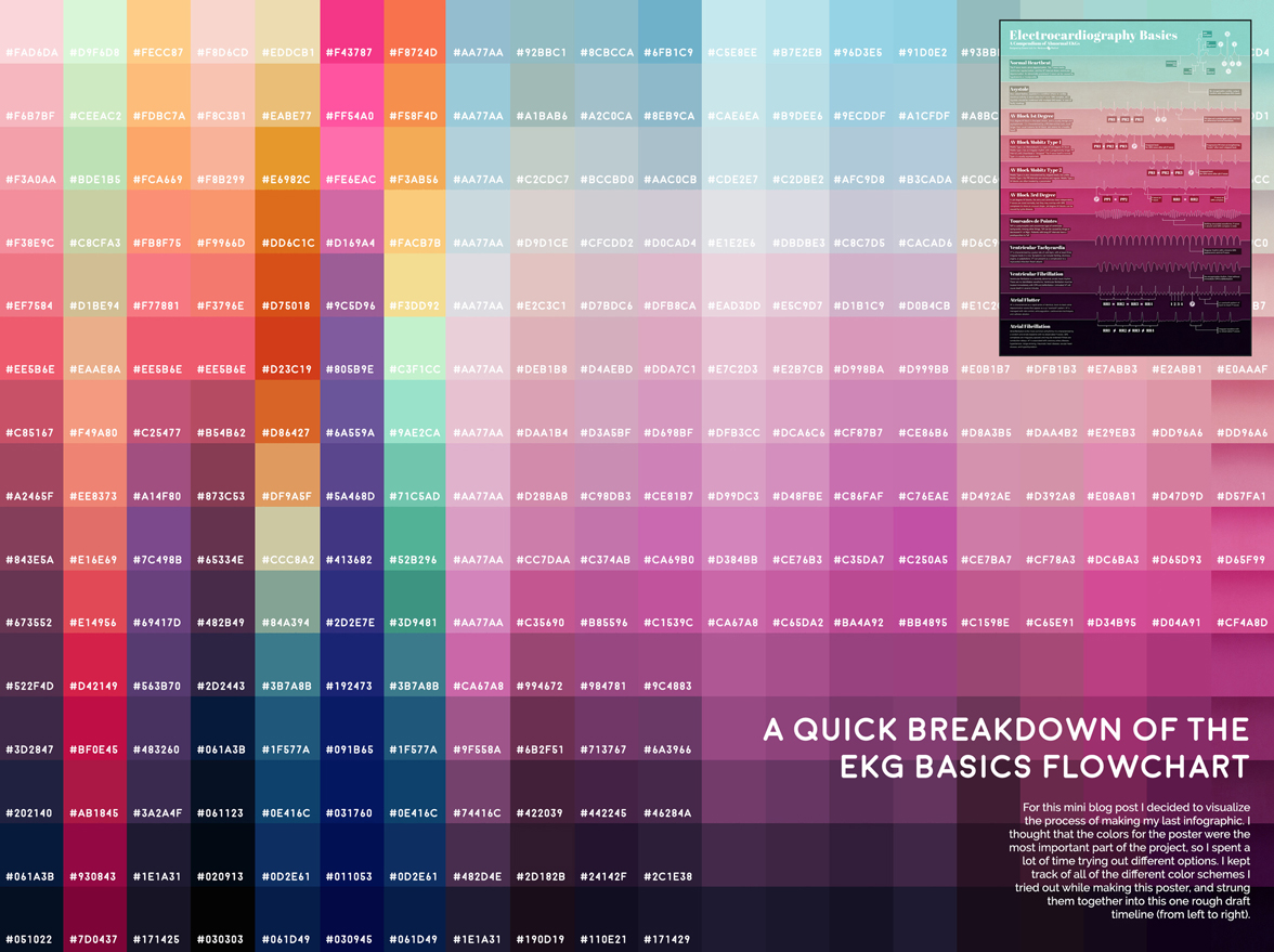
When I started the heartbeat poster I knew I wanted to make the color gradient the focal point. So I spent a lot of time trying out different color options for each blocked section. I kept track of all of the different color schemes and strung them together into one timeline to show you my entire decision process.
All of the text on the poster is white, so I was looking for a series of 15 colors that would look good together and also contrast well with white text. When I finally decided on the blue-to-pink gradient it still wasn’t dark enough, so I ended up adding a black overlay underneath the white font. I also added black shading below the border of every color. During the project we actually shifted some of the original information to a different poster, so the final design has 12 color blocks instead of the planned 15.
After collecting all of my progress pictures into this graphic I was surprised at the number of iterations I needed. Almost two thirds of the different versions were just slightly different attempts at the same general blue/pink theme. Although I’m happy with the end result I realized I should probably work on being a little more decisive when working on projects.

Heartbeats and heart attacks
October 19 2016 · A collaboration with Nerdcore Medical
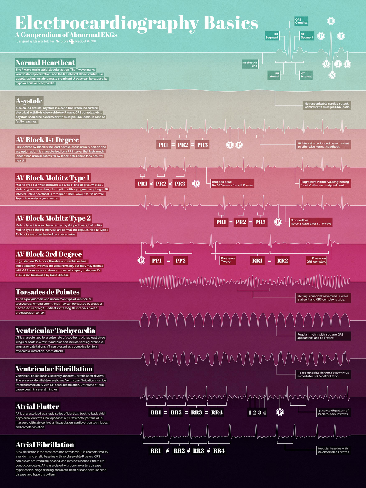
This week’s medical infographic is an introduction to several different kinds of heart disease. The ten featured diseases are some of the most common causes of abnormal EKGs. An electrocardiogram (or EKG) records the electrical activity of the heart, and is used by doctors to screen patients for several types of heart conditions.
To provide a reference for a healthy heartbeat, the first entry in the infographic is an EKG trace from a normal adult (with the important sections labeled clearly). The following 10 entries are all examples of abnormal EKGs of varying severity.
I wanted to highlight the unique shapes of each EKG wave as the focal point of the poster. After trying a few different things, I decided to try and make a digital heartbeat “sunrise,” where each of the EKG waves defined a specific colorful section of the poster. I thought it would show off the simple shape of the waves, and also work as a practical way to section off the different descriptions. I designed each EKG line in Illustrator, and then imported the shapes to Photoshop to add textured shadows, color overlays, and text.
As with my other medical infographics, Dr. Arun Mathews, a Chief Medical Officer in Texas, fact-checked my work and suggested useful articles.
-
Sources
- First Aid for the USMLE Books 1 & 2 (2015). Tao Le and Vikas Bhushan. © 2014 McGraw-Hill Education. Arrhythmia Reference Guide © 2016 Medical Training and Simulation LLC. Ventricular tachycardia, ventricular fibrillation, atrial fibrillation. NIH U.S. National Library of Medicine.
- Fonts used: Abril Fatface by Veronika Burian and José Scaglione from TypeTogether

The architecture of the spine
October 12 2016 · A collaboration with Nerdcore Medical
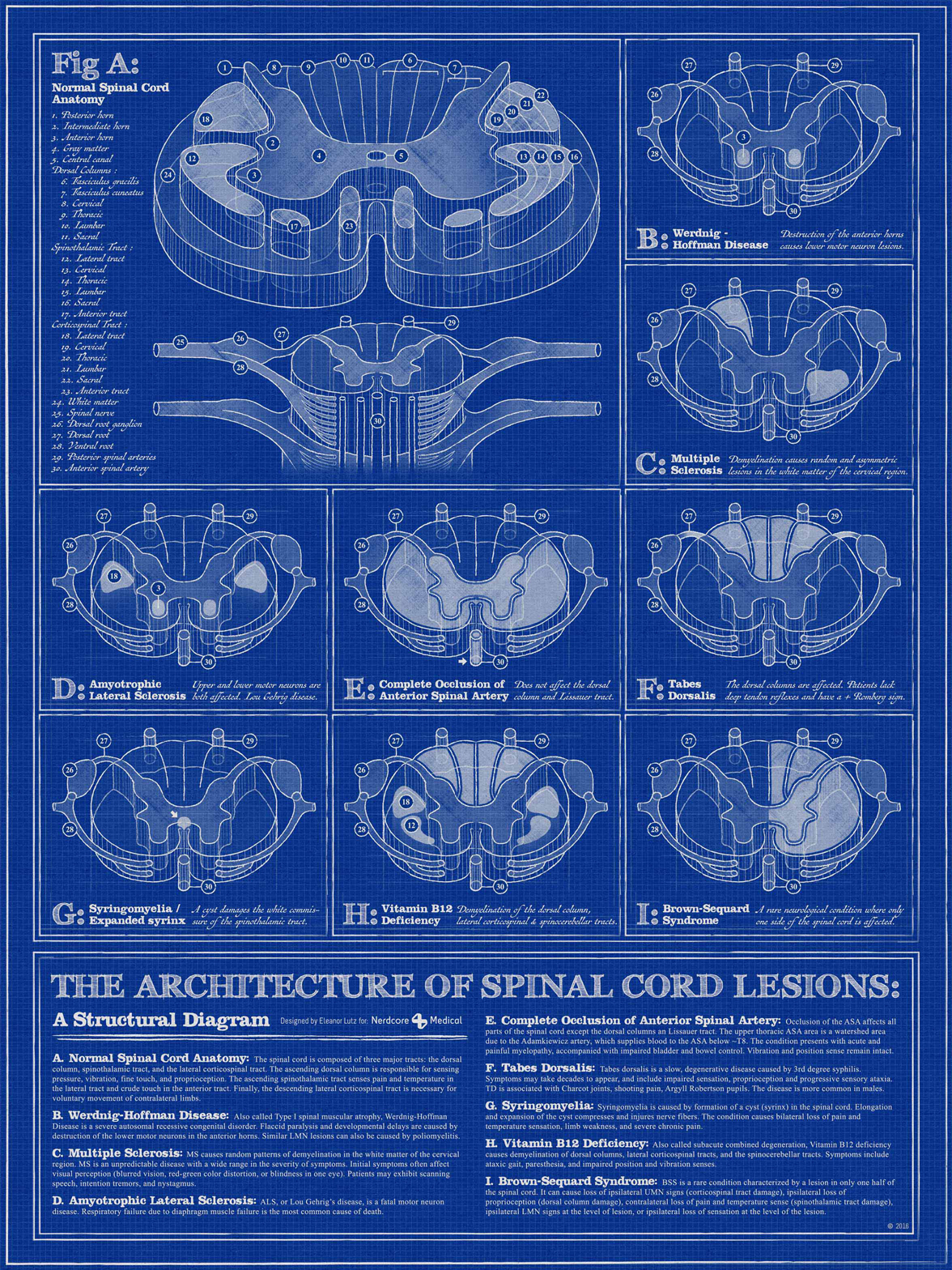
This week’s medical infographic poster is a diagram of spinal cord lesions. The spinal cord section diagrams in my reference books had a really interesting structural style, so I decided to design the poster with an architectural theme to show off all of the 3D section shapes.
A couple months after I finished this poster I took a human neuroanatomy class in grad school. So I actually got to pick up a real human spinal cord and look at all of the different sections. The most surprising part to me was the size - the spinal cord was only half an inch thick at the thickest part. I guess I expected it to take up more space, considering all of the information carried inside.
The memorization for that class was pretty time-consuming, but it was amazing to hold a real human brain in my hand and point out the sections that held all of that person’s memories, or their ability to speak. I think it’ll always be one of my favorite classes.
This “architectural sketch” style was done using the Beautiful Mess Illustrator vector brush set by Pixelwise. I bought the brush set on a whim, so it was an unexpected surprise when they turned out to be exactly what I needed for this project.
The fonts are Antiquarian Scribe by Brian Willson and FFF TUSJ by Magnus Cederholm. I’m slowly building my library of handwriting fonts, so if you have a favorite I’d love to hear which ones you use!
-
Sources
- First Aid for the USMLE Books 1 & 2 (2015). Tao Le and Vikas Bhushan. © 2014 McGraw-Hill Education.
- NIH and National Institute of Neurologic Disorders articles on multiple sclerosis, spinal muscular atrophy, tabes dorsalis information, amyotrophic lateral sclerosis (ALS), syringomyelia, Brown-Sequard syndrome, and an anterior spinal artery syndrome case study.
