Making animated GIFs in Python
November 14 2016 · Link to the full-size color palette generator
This week’s blog post is a quick break from science infographics! I use Python pretty often at work, and recently I’ve also been experimenting with using it for design. For this project I wanted to make a browsable color palette website like Adobe Kuler, but with animated design examples for every color palette.
To do this I first wrote a Python script to make a GIF illustration for any 5-unit color scheme. The script features five different animated patterns, all based on Islamic mosaics. The code isn’t anything fancy - I used the basic Matplotlib graphing library to make each pattern and ImageIO to output images.
Next I picked 50 of my favorite color palettes, most of which were loosely based on popular colors from Kuler and Color Hunt. I decided to stick with only colorblind-friendly color palettes for a more useful and curated project.
I also wrote a script to generate titles for each color scheme. A lot of online color palettes have great names like Cherry Cheesecake, and I wanted to try and automate my own whimsical titles.
For the title generator I made a library of my favorite color names organized by color (pumpkin, cherry, buttermilk), as well as modifier words. Next I specified which two colors were dominant in each color palette, and let my script generate appropriate color scheme names for each entry.
Finally I combined all of the code and fed my list of 50 color palettes into the GIF-and-title maker. The final website randomizes the color schemes in Javascript so that it’s more fun to click through each color palette.
EDIT: I’ve open-sourced the Python code here for anyone interested in the project.
-
Sources
- Arabesques: mosaïques murales (XVe. & XVIe. siècles). (Prisse d'Avennes 1877). Geometric patterns & borders (David Wade 1982). Mosaik aus der Moschee des Galaon el Alfi auf der Citadelle zu Kairo (Friedrich Hessemer 1842). The Color Oracle color blindness simulator.
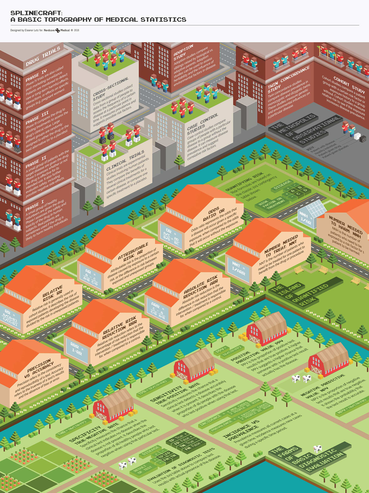
The map of medical statistics
November 2 2016 · A collaboration with Nerdcore Medical
This week’s medical infographic poster explains common medical statistics terms. Since statistics is a little lacking in the illustration department (compared to anatomy or chemical reactions), I got to have a lot of creative freedom with the project.
I knew I wanted to illustrate all of the drug trial types with actual people, so I pitched the project as an isometric “Land of Observational Studies.” At first I wasn’t planning on a river divide between the three sections of the poster, but after talking with Arun I really liked his idea to emphasize the differences in complexity between sections.
I think most people work on isometric art in vector programs like Illustrator, but I decided to draw this particular poster in Photoshop. I laid out an isometric grid for reference, and then filled in each of the buildings following the reference grid. The pixel cows are probably my favorite decoration.
-
Sources
- First Aid for the USMLE Books 1 & 2 (2015). Tao Le and Vikas Bhushan. © 2014 McGraw-Hill Education.
- Fonts: Pixel Emulator by Pixel Saga.
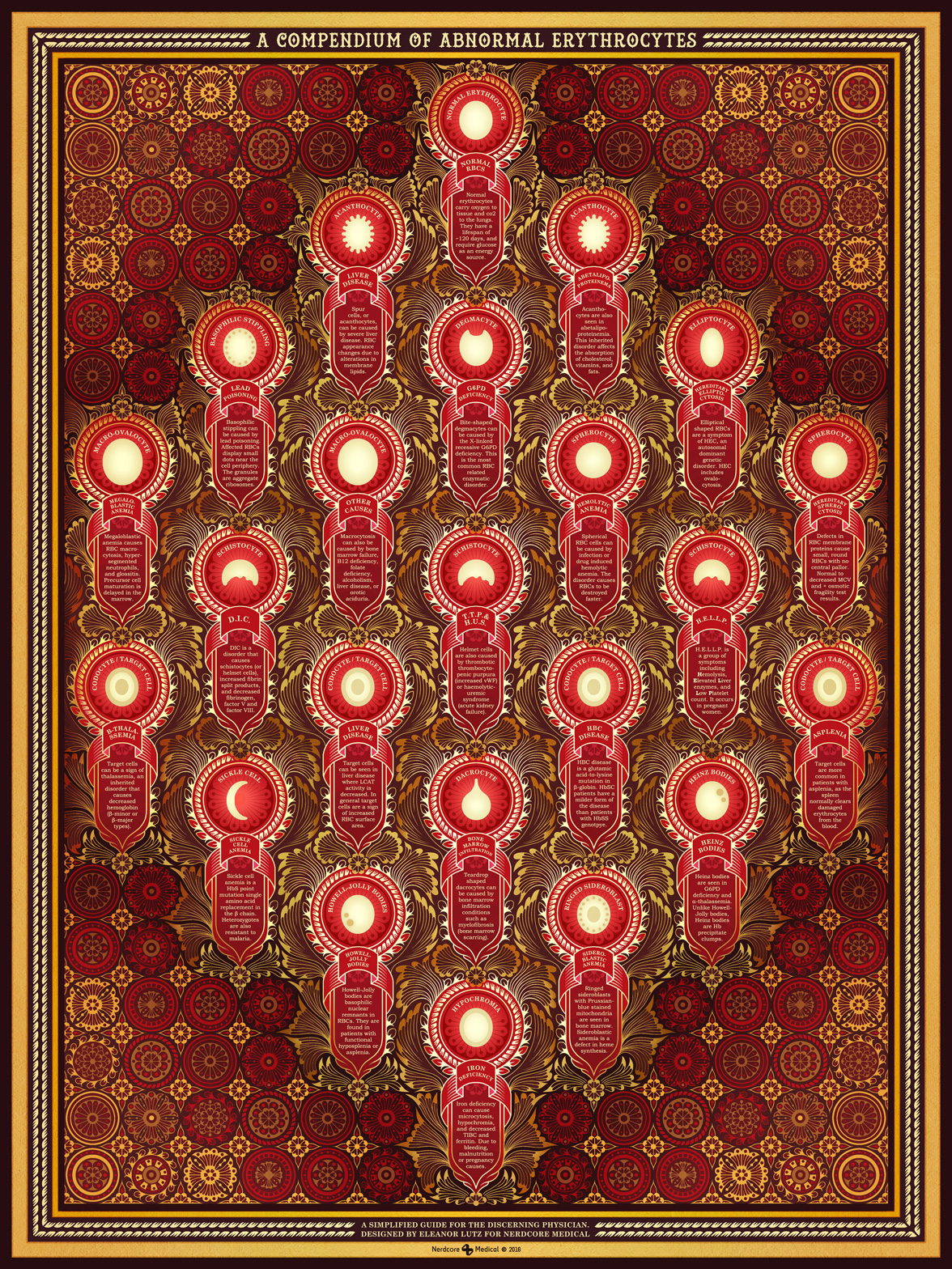
A compendium of abnormal red blood cells
October 26 2016 · A collaboration with Nerdcore Medical
This week’s collaboration with Nerdcore Medical is an ornamental poster showing the different kinds of abnormal red blood cell shapes. The style I picked for this poster was inspired by hand-woven rugs and Rococo stucco work.
When I started this project it was really hard to figure out what to do with the simple shapes of the red blood cells. I kept trying to make the design more interesting by adding details or shading or patterns to each cell.
But finally I stopped trying to make the cells more complicated than they needed to be, and went with the complete opposite approach. For the final design I made the cells extremely minimal, and then piled on detail everywhere else.
To make the decorative pattern I drew everything first in pencil, and then scanned it into Photoshop to copy and paste together. I originally drew this poster in navy blue - and then had a real “why didn’t I think of that” moment when Arun suggested red to match the red blood cells. Needless to say we went with red for the final poster.
-
Sources
- First Aid for the USMLE Book 1 (2015). Tao Le and Vikas Bhushan. © 2014 McGraw-Hill Education, Abetalipoproteinemia (Genetics Home Reference, NIH U.S. National Library of Medicine), Thalassemia (Division of Blood Disorders, CDC), Haematological Methods (Prevention of Thalassaemias and Other Haemoglobin Disorders: Volume 2), Hemoglobin C Diseases (Conference on Hemoglobin: 2–3 May 1957), Basophilic stippling of red blood cells (Cheson et al. Am J Ind Med)