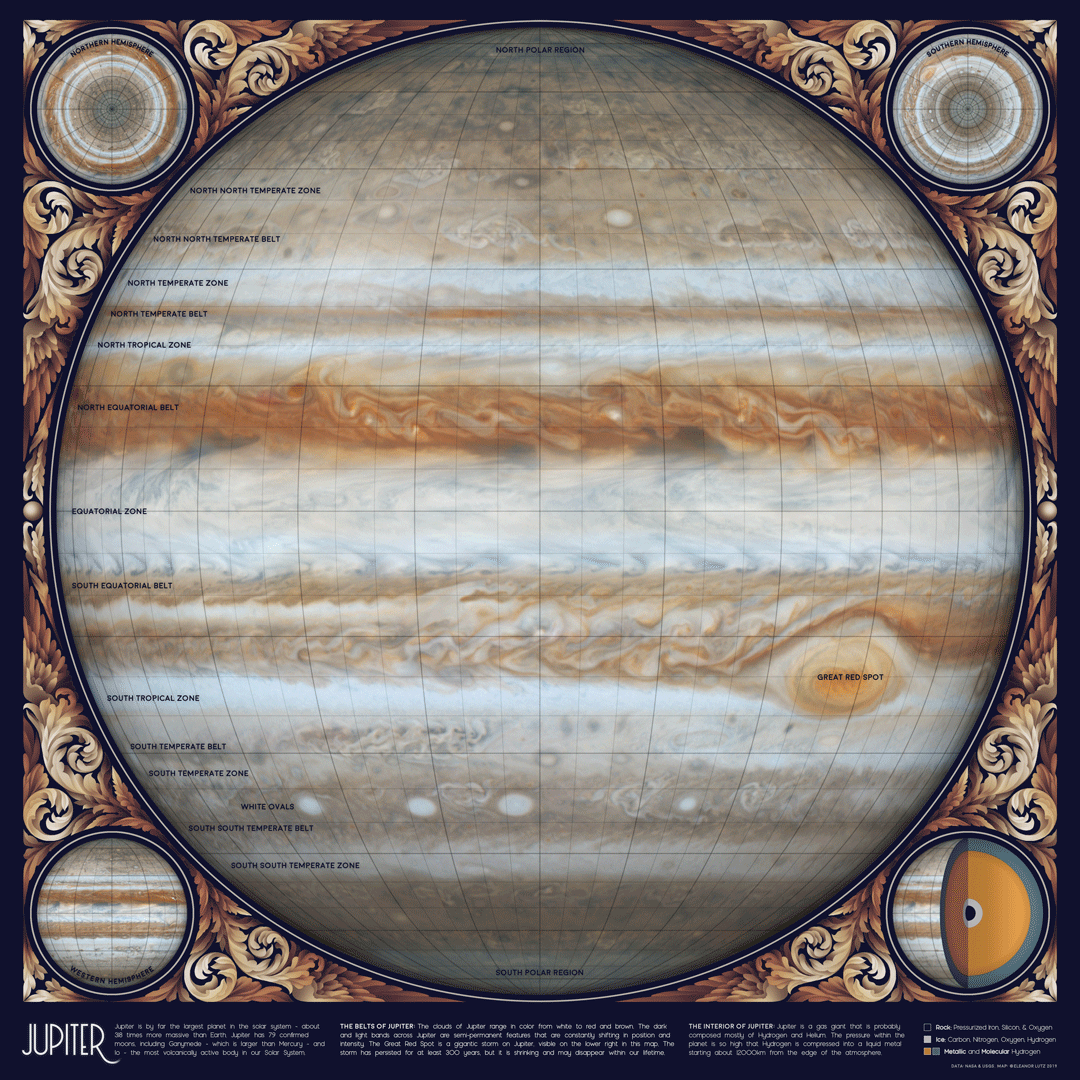
An Animated Sketch of Jupiter
August 2 2019 · Link to the Open-Source Code
This week’s map is just for fun! The animated GIF illustrates the storms on Jupiter, but it’s an artistic drawing rather than an accurate representation of the clouds in real time. The majority of the work was done in Photoshop, based on images published from the Cassini spacecraft in 2000 and 2006.
At first I wasn’t planning to map Jupiter, because the surface is constantly changing. We also have much less information about the gas giants compared to the rocky planets closer to Earth. But then I found this awesome video of Jupiter’s clouds, and I decided to edit the film into a repeating cycle.
To make a more detailed design, l I used Cassini’s high-resolution Jupiter map as the background, and placed the lower resolution video on top as a semi-transparent layer. Cassini’s video doesn’t include any data for the North or South poles, so the very top and bottom of this map aren’t animated. You can probably see the discontinuity at about the second bolded latitude line (though it’s not too noticeable because of the low wind speed near the poles).
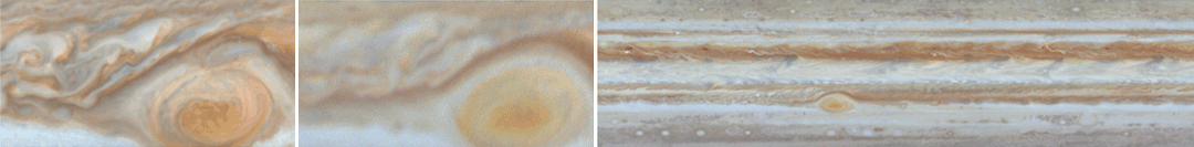
 The high-resolution version of Cassini’s Jupiter map (1) is much more detailed than the video version (2). I combined both of them together to get both detail and animation into the design. The original video doesn’t actually loop, but you can gradually fade the frames at the end of the movie to give the illusion of continuous flow. I also removed the occasional shadowy blotches cast by Jupiter’s moons, and edited the colors and contrast in the video to match the background image.
Although I labeled some of Jupiter’s cloud layers, the storms are constantly shifting and individual bands can move or change color over time. Even the Great Red Spot, a huge storm big enough to swallow the Earth whole, is gradually shrinking and could disappear within our lifetime.
-
Sources
- Data: PIA07783. Cassini's Best Maps of Jupiter (North Polar Map). © 2006 NASA, JPL, and the Space Science Institute. PIA07784. Cassini's Best Maps of Jupiter (South Polar Map). © 2006 NASA, JPL, and the Space Science Institute. PIA02863. Planetwide Color Movie. © 2000 NASA, JPL, and the University of Arizona. PIA07782. Cassini's Best Maps of Jupiter (Cylindrical Map). © 2006 NASA, JPL, and the Space Science Institute. Reference texts: Astronomy, Andrew Fraknoi, David Morrison, Sidney C. Wolff et al. © 2016 OpenStax. Fonts: The labels on this map are typeset in Moon by Jack Harvatt. The title font is RedFlower by Type & Studio. Advice: Thank you to Chloe Pursey and Leah Willey for their helpful advice in making this map.
Constellations from Around the World
July 29 2019 · Link to the Open-Source Code
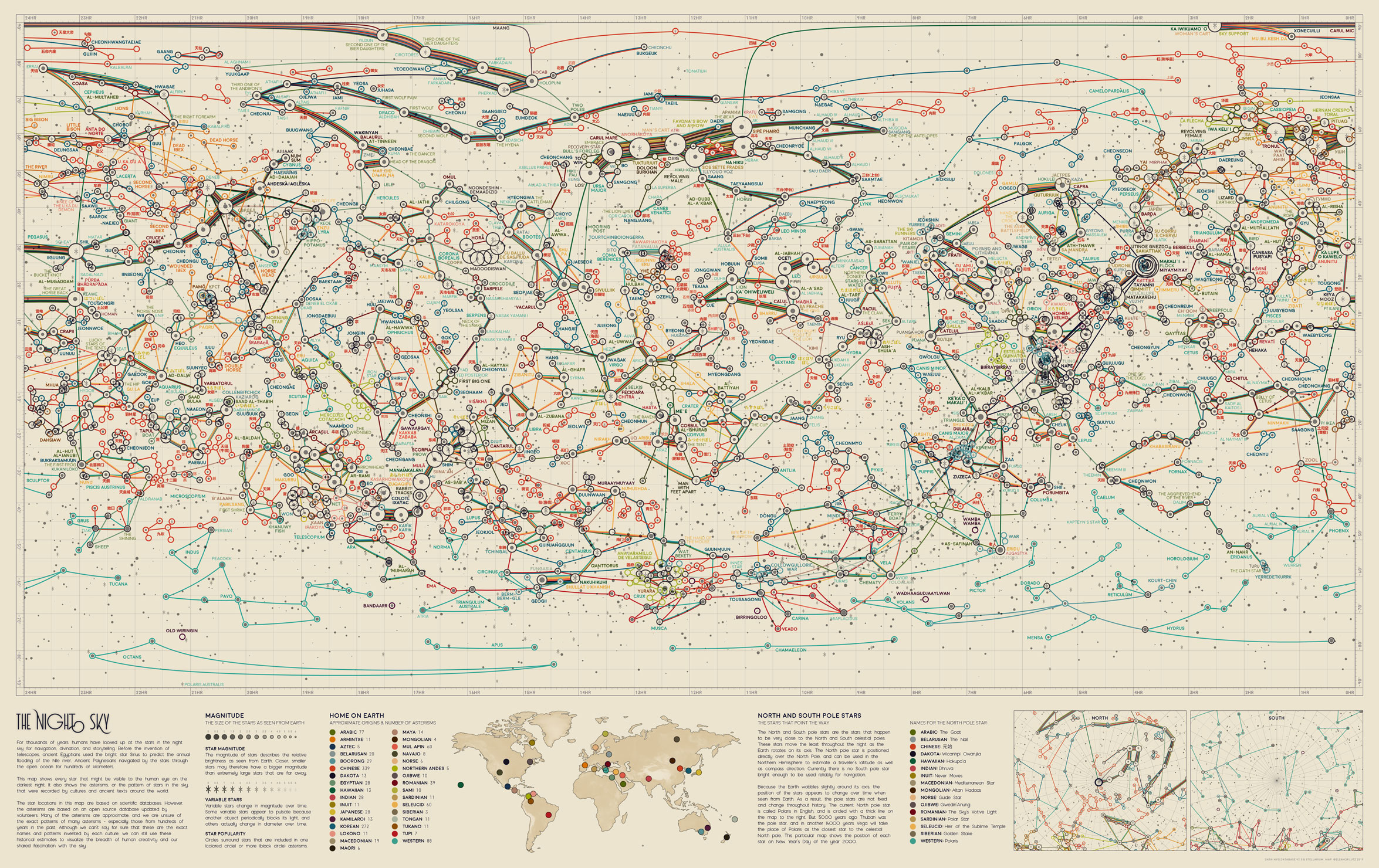
Two weeks ago I shared a map of all the stars you can see from Earth, alongside the Western constellations. But the Western constellations are only one of many patterns of stars invented by cultures around the world. This week’s map illustrates the animals, people, and objects imagined in the sky by more than 30 different civilizations.
To make this map I used data from Stellarium, an open-source planetarium software that includes constellations from ancient Dakota, Hawaiian, and Mongolian cultures, among many others. Some of my favorite constellations were the Stars of Water, Rabbit Tracks, and the Hippopotamus, and I also really liked the star names The Oath Star, Lady of Life, and The Hand of the Mouse.
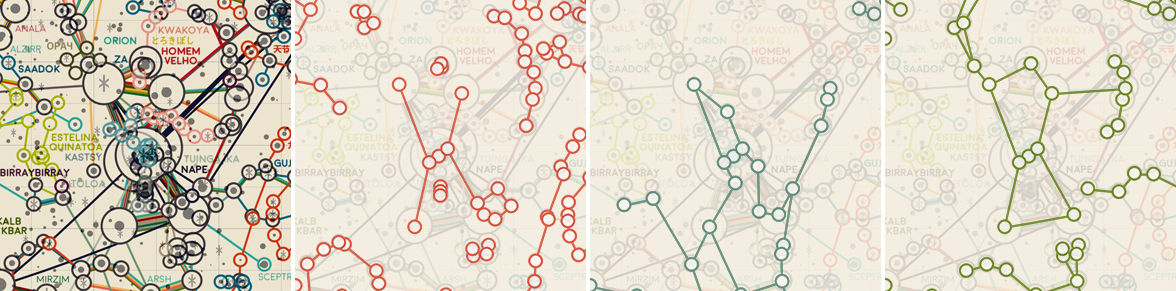
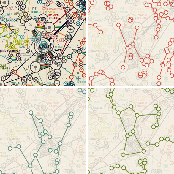 The stars around the Western constellation Orion are one of the busiest places on the map. Some of the individual cultures are highlighted here, including the Chinese constellations in red, ancient Egyptian in turquoise, and Arabic in green. I really liked that each of these cultures included the triple stars in “Orion’s belt”, but still interpreted the star patterns in a completely different design.
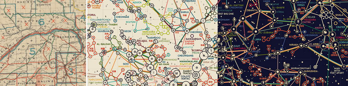
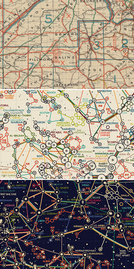 The color scheme for this map was inspired by antique roadmaps, like this map of Nebraska from 1898. But this is the only map in the series without a dark background, and I wasn’t quite convinced that a lighter background could work for a star map. I even made two different versions before finally deciding to stick with the original color scheme.
I originally wanted to label the constellations in each culture’s language, but the translations for Stellarium are an ongoing process (that you can help out with, by the way!). I did the best I could by including Chinese labels, which were already fully translated in Stellarium, and by adding phonetic ひらがな labels for Japanese moon signs (I speak Japanese).
This map was definitely one of my favorite designs. At first I was worried that with so many constellation lines, the map would look like a tangled ball of yarn. So I was pleasantly surprised to see that the “ball of yarn” still had a clear pattern - the brightest stars were shared across almost every single culture across the world. I’ll admit that the final map is probably a little too busy to clearly see the individual constellations. But in the end I think the charm of this dataset is seeing the crisscrossing connections shared across the globe, even if the lines are a little entangled.
-
Sources
- Data: Stellarium. © 2019 version 0.19.0. HYG Database version 3. © 2019 David Nash. Reference texts: Astronomy, Andrew Fraknoi, David Morrison, Sidney C. Wolff et al. © 2016 OpenStax. Fonts: The labels on this map are typeset in Moon by Jack Harvatt. The title font is RedFlower by Type & Studio. Advice: Thank you to Nadieh Bremer, Oliver Fraser, Chloe Pursey, and Leah Willey for their helpful advice in making this map.
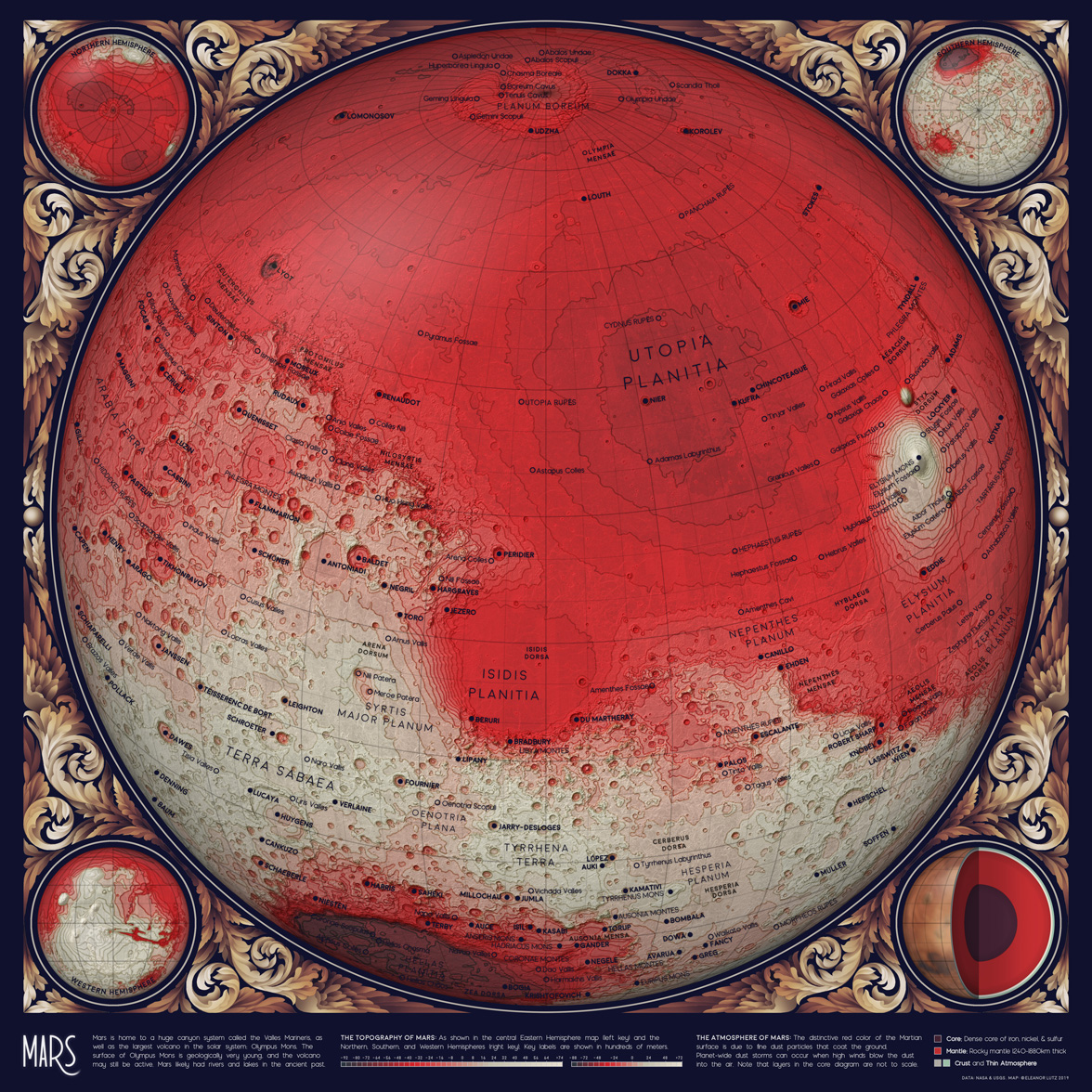
A Topographic Map of Mars
July 22 2019 · Link to the Open-Source Code
This week’s map is a topographic map of Mars! I already shared the code to make these topographic maps a few weeks ago, so for this blog post I decided to write a better description of how I illustrated the ornamental borders and decided on a design style for the map collection. Although style design was the least technical part of the project, I think it actually took just as much time - if not more - than any of the code for individual maps.
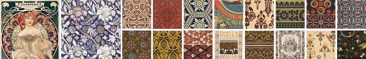
 For this project I wanted to combine large datasets with the hand-crafted design style of artists like William Morris or Alphonse Mucha. To organize my thoughts I collected a big folder of inspiration images from sources like the New York Public Library Digital Database.
When I started this project I initially wanted to design different border decorations for every topic. I sketched a collection of 18 different repeated patterns, each meant to go alongside a unique astronomy theme like planets, galaxies, space missions, or satellites. But as the project continued I realized there was so much data that the detailed borders made the maps look too cluttered. In the end I removed all of the borders and designed just one scrollwork illustration to wrap around rounded map projections like this Mars map. In these round maps I thought the shift from detailed map to blank paper was a bit too abrupt, so this was a good compromise between data-heavy and illustrative design styles.

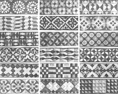 I like to start my projects by sketching outlines and graphs using pencil and paper. Most of my sketches aren’t as neat as this example, but it’s much easier for me to experiment with shapes when I’m drawing in a physical sketchbook. For color palettes I jump straight into digital design, where it’s much faster to make small changes in hue or saturation.
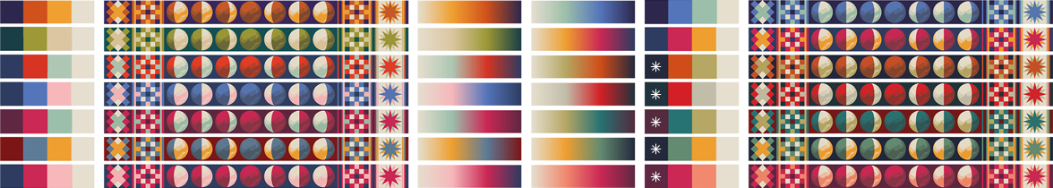
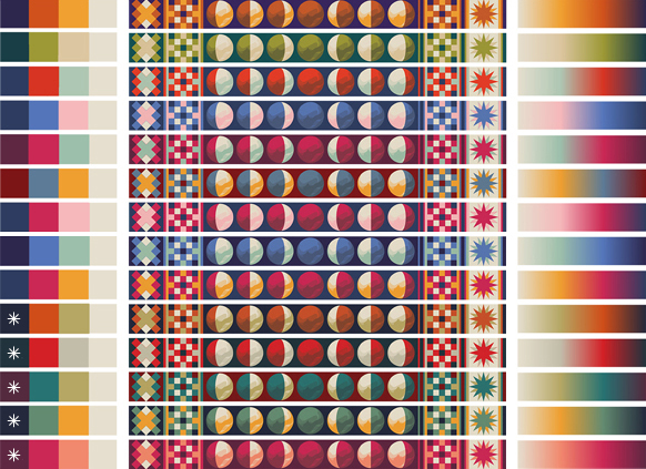 The 14 color schemes I designed in the beginning of the project. Each color palette is shown in several different ways, because I wanted to design versatile color schemes that could work as discrete elements, or as pieces of a complex pattern, or as a gradient in topographic maps. The color schemes marked with an asterisk were used as gradients for topographic maps, but the rest either didn’t make into the final collection or were only used as part of larger color palettes, such as the geologic maps.
With the borders removed from the project, the scrollwork surrounding the round maps were the most illustration-heavy part of the map collection. When I paint decorations like these in Photoshop, I begin each design as a solid white shape and then gradually break away pieces into detailed chunks. Next, I brush away pieces of each section with the brush eraser tool until the pieces look like a fully-shaded monochrome design. I wait to add color until the very last step, where I use many different colors and overlay layers for a richer effect.
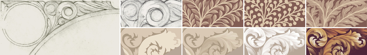
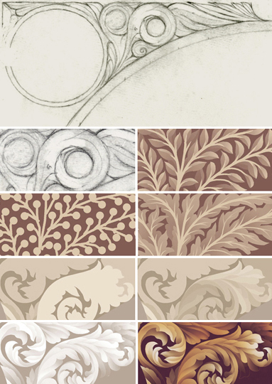 To design the scrollwork border I first sketched a rough outline of the shapes in pencil. I tried a couple different iterations of leafy scrolls before finally picking a less botanically inspired design. In this snapshot the top half shows the sketching process - where I tried out many different shapes - and the bottom half shows the actual illustration process, beginning with very large sections of solid color and ending with many small, shaded segments.
I’ve updated all of my tutorials for decorated maps with a section on design, as well as a piece of the scrollwork illustration file. The file includes the original layers as reference for those of you want to use a similar style in your own projects.
-
Sources
- Data: Gazetteer of Planetary Nomenclature, International Astronomical Union (IAU). © 2019 Working Group for Planetary System Nomenclature (WGPSN). Mars In Depth. © 2019 NASA Science Solar System Exploration. Stellarium. © 2019 version 0.19.0. Mars HRSC MOLA Blended DEM Global 200m v2. © 2018 NASA PDS and Derived Products Annex. USGS Astrogeology Science Center. Reference texts: Astronomy, Andrew Fraknoi, David Morrison, Sidney C. Wolff et al. © 2016 OpenStax. Fonts: The labels on this map are typeset in Moon by Jack Harvatt. The title font is RedFlower by Type & Studio. Advice: Thank you to Oliver Fraser, Henrik Hargitai, Chloe Pursey, and Leah Willey for their helpful advice in making this map.